Modern Sans-Serif Fonts for Branding and Editorial Design
Modern sans-serif fonts have moved past the role of "just clean." They’re now an active design choice with their own personality. Geometric frames, consistent stroke widths, and small unexpected details (upside-down S, extra-long terminals) separate them from plain industrial sans-serifs.
This list covers the modern sans-serif fonts we use and recommend, from our own catalog plus a few free Google Fonts. Each entry includes a quick note on what makes the design distinctive and where it works best.
For the bold-weight variants, see our bold sans-serif fonts post. For the serif equivalent, see modern serif fonts.
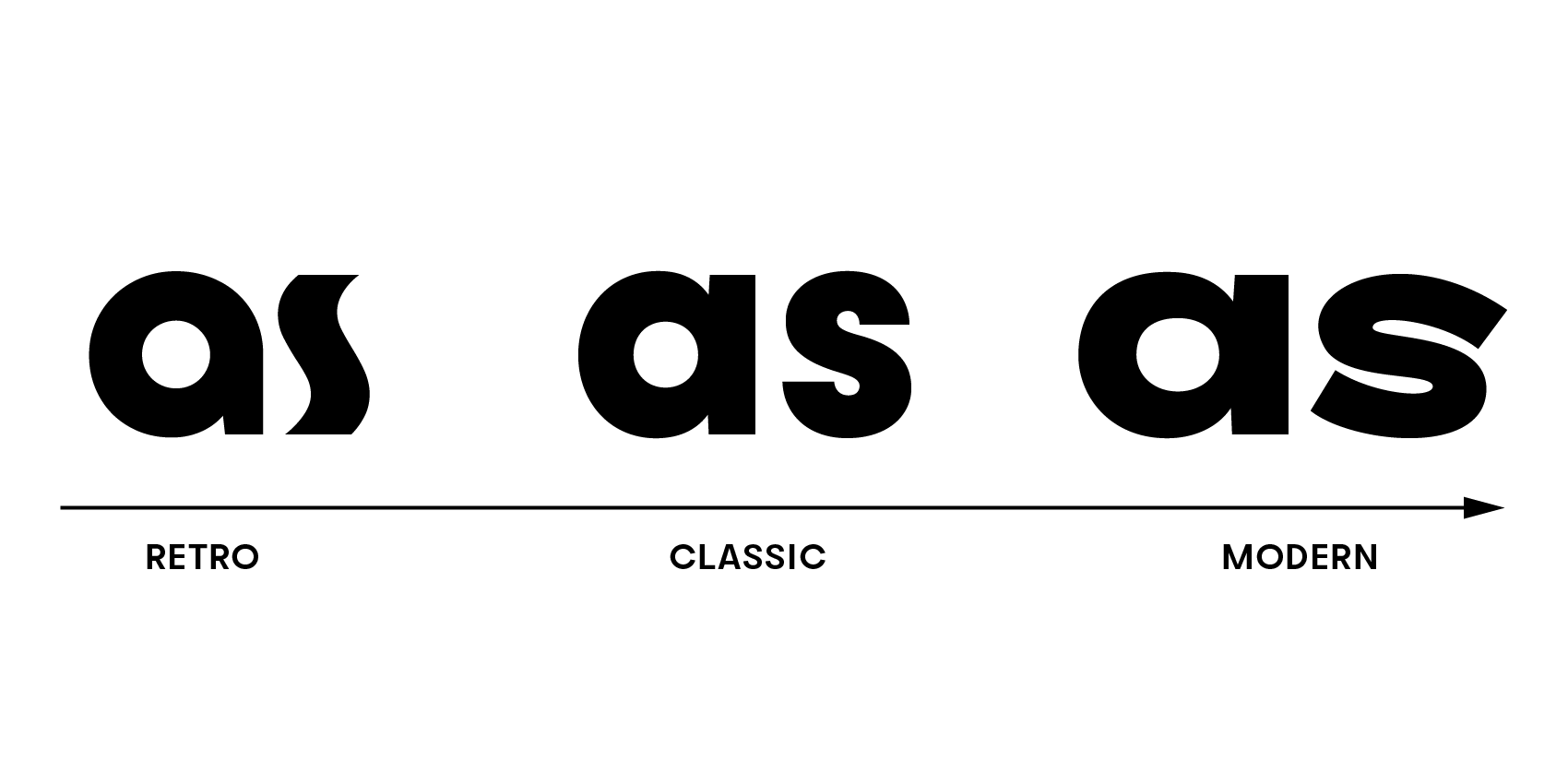
What makes sans-serif fonts modern are features like a geometric frame, consistent line thickness, and creative details that add personality—think letters with unique twists like an upside-down letter S or extra-long terminals (ending of a stroke) that reach further than they usually do. These fonts aren’t just about looking good; they’re about adding character to the text.
On the flip side, classic sans-serif fonts go for a more timeless vibe. They’re often a bit narrower and may stick to a rather traditional look with a tiny bit of line contrast, especially when it comes to text fonts.
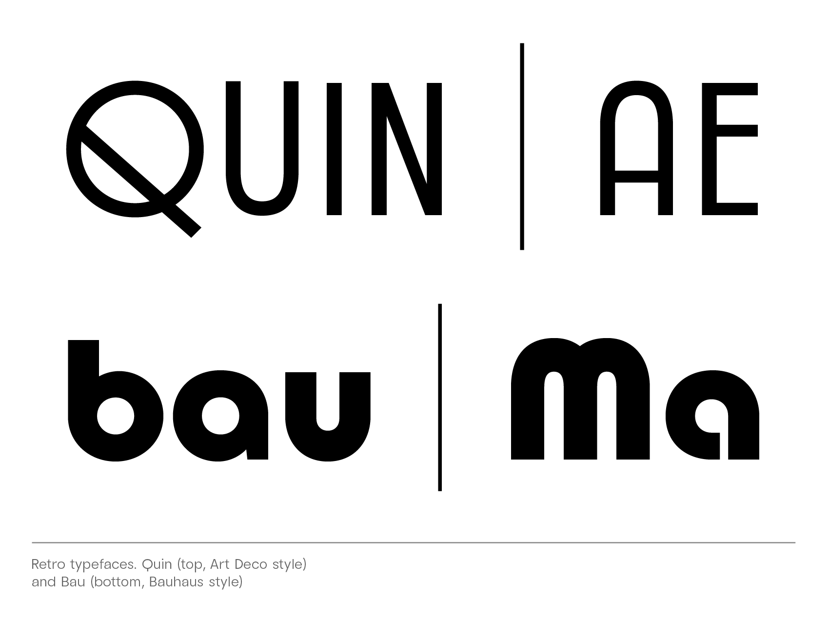
Retro fonts follow distinct design principles prevalent in those specific times. For example, a Bauhaus font is simplified and constructed from geometric shapes. Or, an Art Deco typeface plays with the contrast of some letters being geometric and some being narrow (condensed). Crossbars may be higher or lower than in classic sans designs.
While modern sans-serifs grab your attention either with their minimalist approach or with their individuality, classic typefaces fit in smoothly anywhere in between, prioritizing ease of reading.
Our top picks: modern sans-serif fonts from our collection
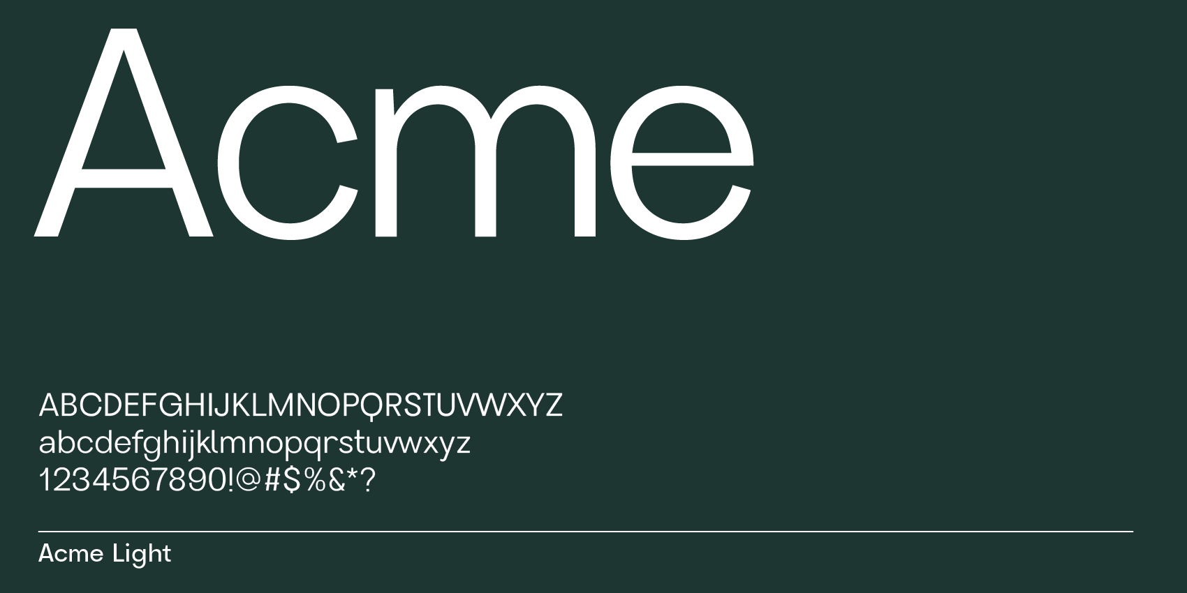
Acme, cool sans-serif font for display and text
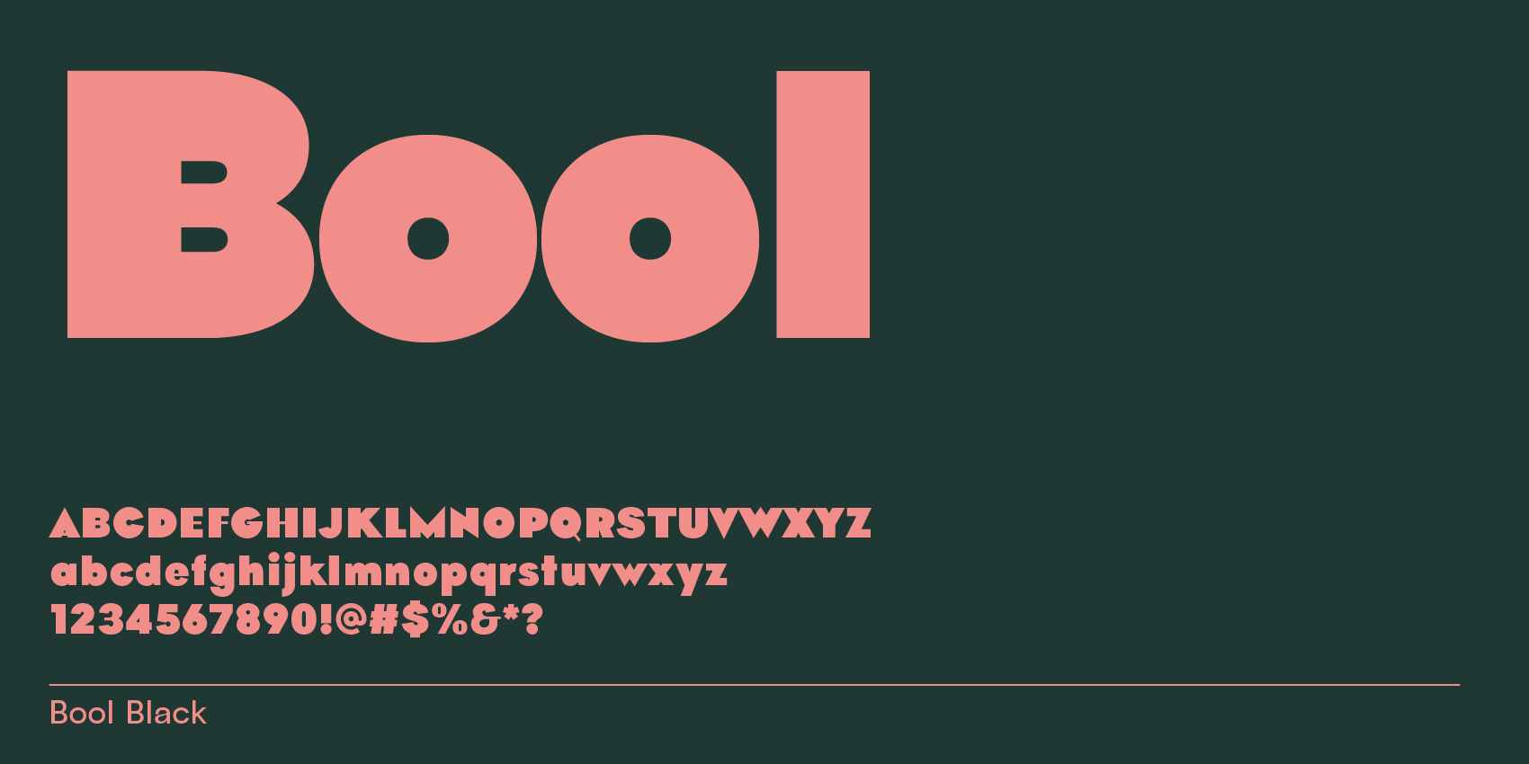
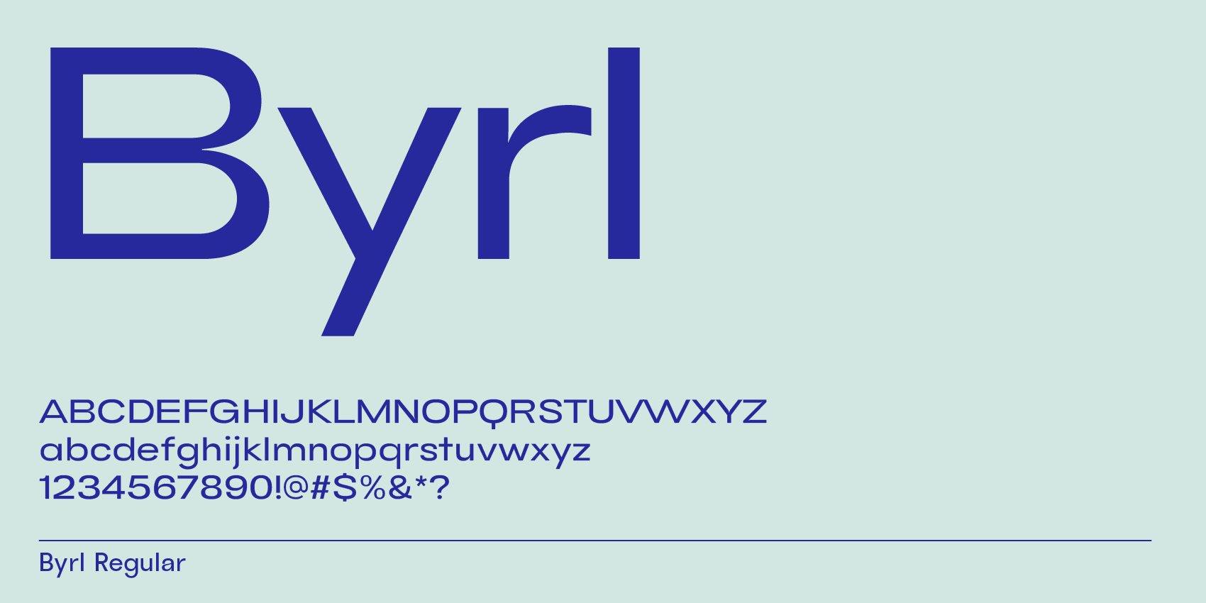
Byrl, wide (extended) sans-serif font
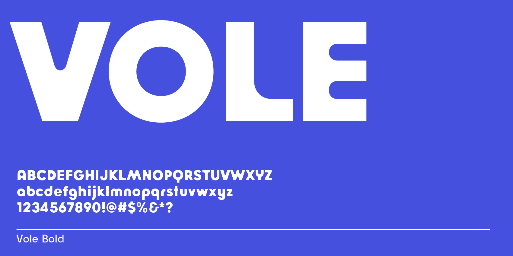
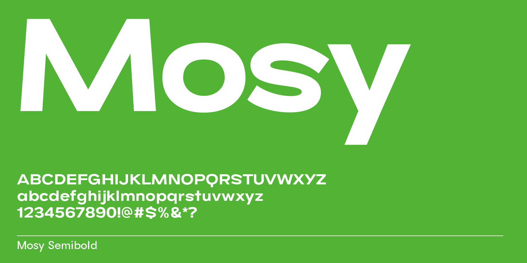
Mosy, friendly modern sans-serif font
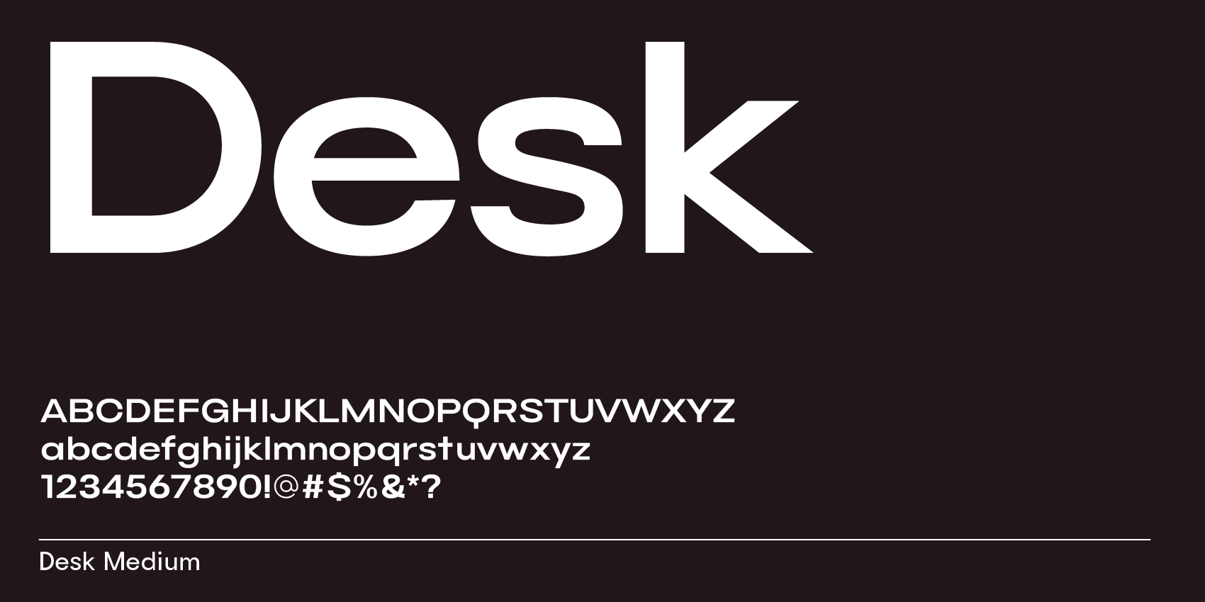
Desk, extended font for tech and design

Nuido, soft rounded sans-serif font for logos and branding
Strengthen your design without cost: best free sans-serif fonts from Google Fonts
While there’s a handful of sans-serif fonts on Google Fonts that are very popular and have a modern feel—think of Poppins and DM Sans—solely having a geometric frame doesn’t make a font modern anymore in 2024. Instead, we’re pointing at the trend of maximalism in design and are looking for additional character within the typeface design.
Here’s our top 5 list for free modern sans-serif fonts on Google Fonts—from most modern to more classy:
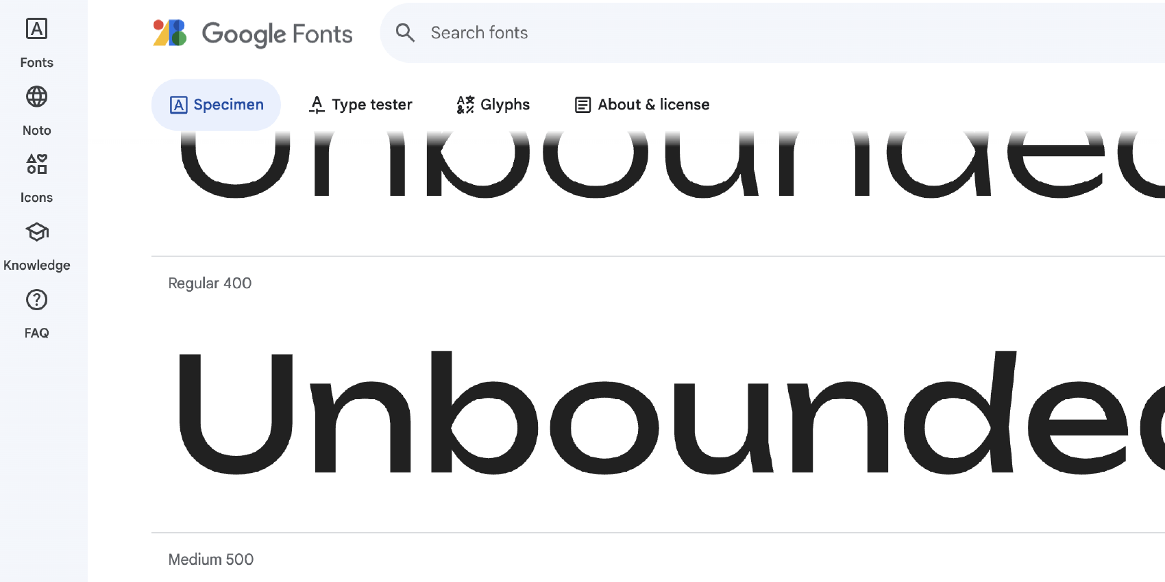
1. Unbounded
This font is extended, breaking its stems like decorative broad-nib lines with a tidbit of handwritten character.
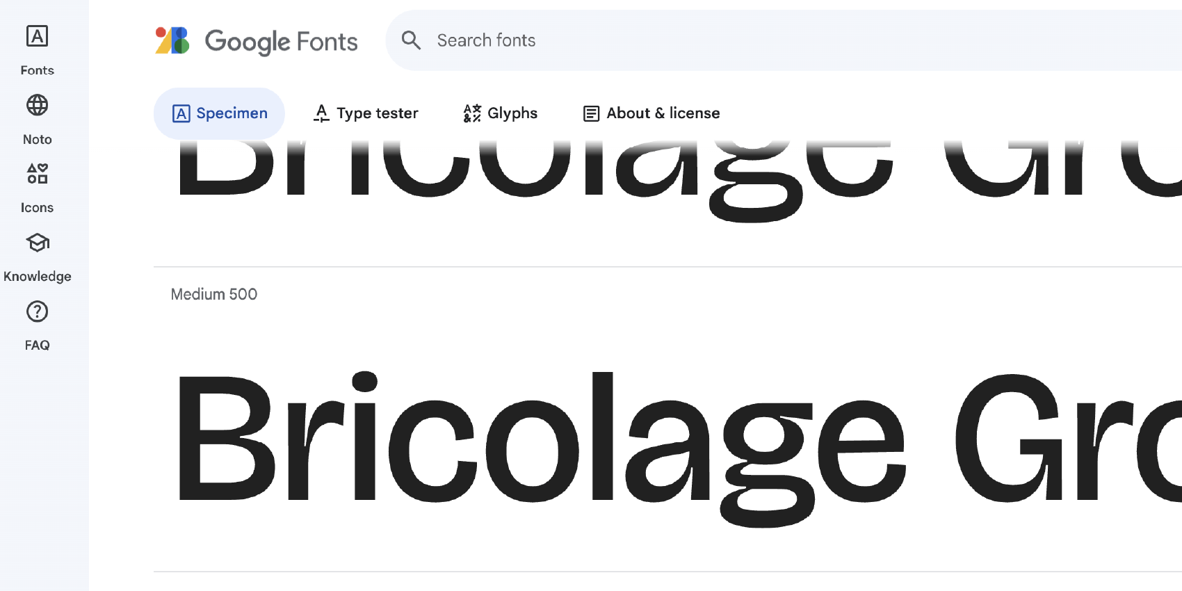
2. Bricolage Grotesque
This typeface puts ink traps front and center. It has a handwritten feel to it and friendly terminals with an underbite for letters e and s.
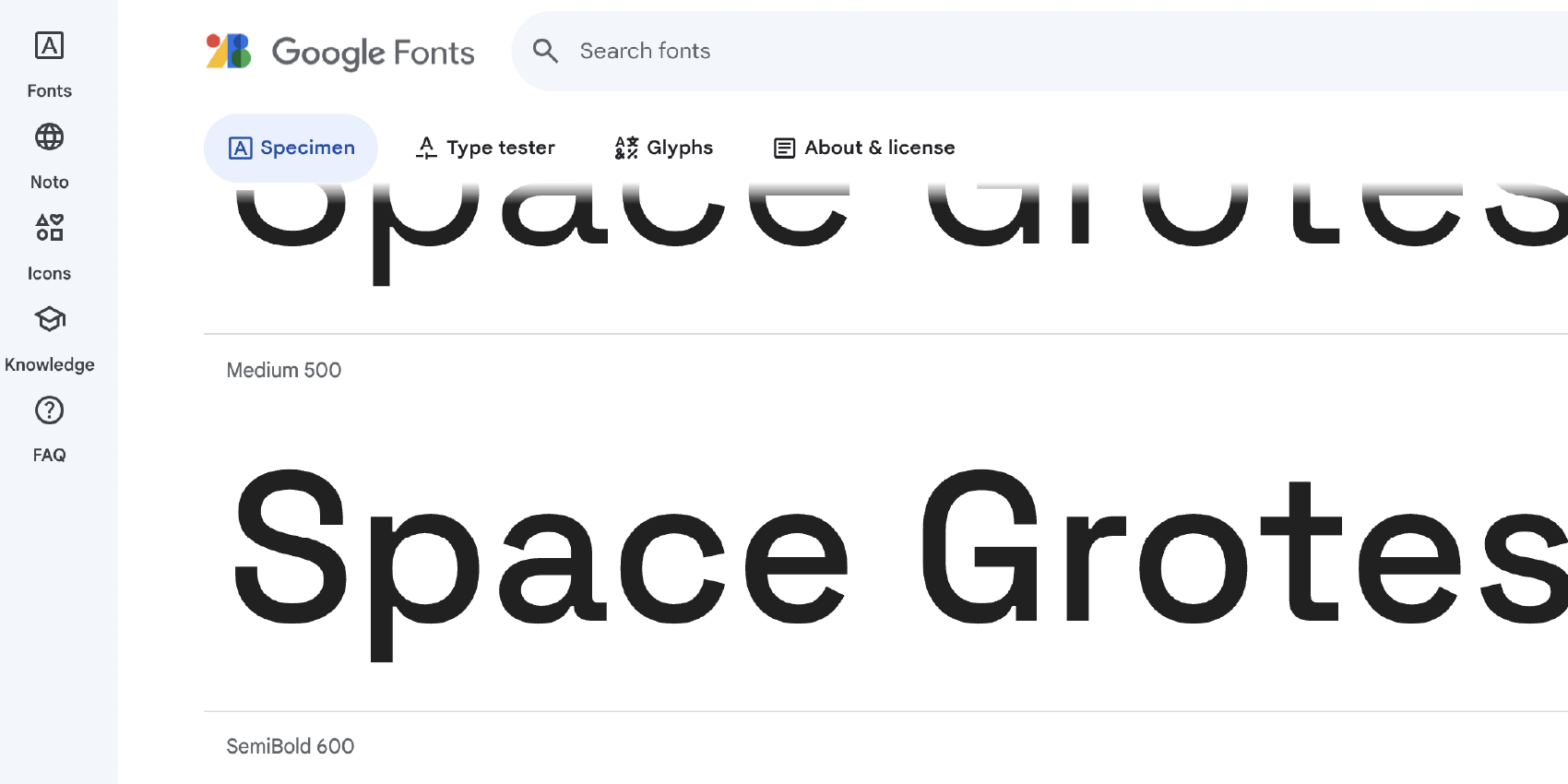
3. Space Grotesk
Letter s is leaning back, letters a, g, r, and t are squarish, and the vertexes of V and W are shifted horizontally, adding a quirky and more technological feel.
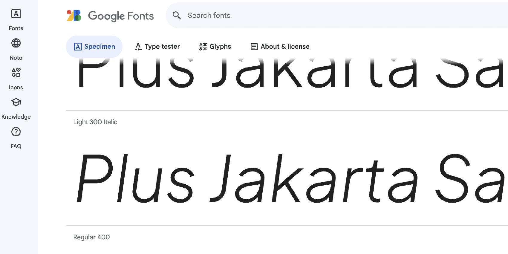
4. Plus Jakarta Sans
This font gets its character from being a bit odd—may that be on purpose on an accident. Letter s is slightly tilted, the letter t’s ascender is filled in, and letter c is cut diagonally, adding to an overall modern feel for this sans-serif font.
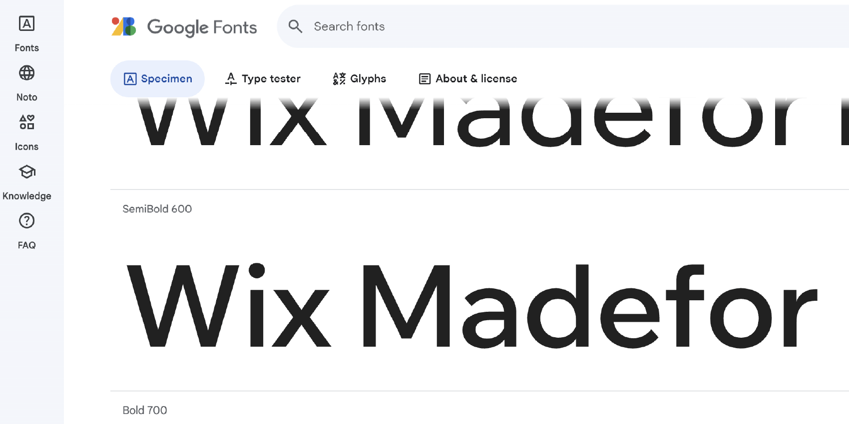
5. Wix “Madefor” Display
Similar to Gotham, known as the Obama font, Wix “Madefor” Display uses a very geometric style but a squarish f-arch and a minimally peculiar s with its spine sticking out slightly.
Related reading: for the specific geometric subgenre, see our post on geometric sans-serif fonts. For fonts with a perfectly circular lowercase o, see fonts with a round o.
For a deeper look at Apex’s triangle A variations, see our post on Apex, font with triangle A.