Skip to content

Bold sans-serifs: Not just loud, but profoundly expressive

Bold sans-serif fonts break stereotypes, revealing depth and personality through design nuances that make each character stand out.

Bold sans-serif fonts redefine their role in typography, challenging the notion that they’re only suitable for bringing simplicity and youthfulness. Far from simplistic, the bolder iterations of sans-serif fonts offer type designers a canvas to celebrate the font’s inherent character. It’s in these heavier versions that the craft of type design shines through, transforming what could be straightforward into something with personality.

For instance, consider the subtle nuances that can be amplified in bold sans fonts: middle horizontal crossbars that are very light compared to their thicker counterparts at the top and bottom, or the bowls of letters like ‘o’, ‘b,’ and ‘d’, which can adopt a slightly squarish shape, presenting an even younger more playful touch. Terminals may finish in brush-like strokes, giving a dynamic, almost handwritten quality to the typeface. These deliberate design choices emphasize the font family’s traits, making the bold weights not just louder but more articulate.

Modern designs of bold sans-serif fonts question the traditional conception of sans fonts as the embodiment of minimalism. With straight stems giving way to more playful and engaging forms, these fonts welcome a more fun, accessible character. This doesn’t weaken their impact but instead enhances their approachability, helping designers to add character in a strong and meaningful way.

Our type studio loves the versatility of bold sans fonts. Below, we have created a collection of ten bold sans-serif fonts that are as much about delight as they are about making a bold statement. These fonts are testaments to the idea that sans-serif can be both sober and spirited.

1. Bool, playful in bold with shifted counters

Bool, playful in bold with shifted counters

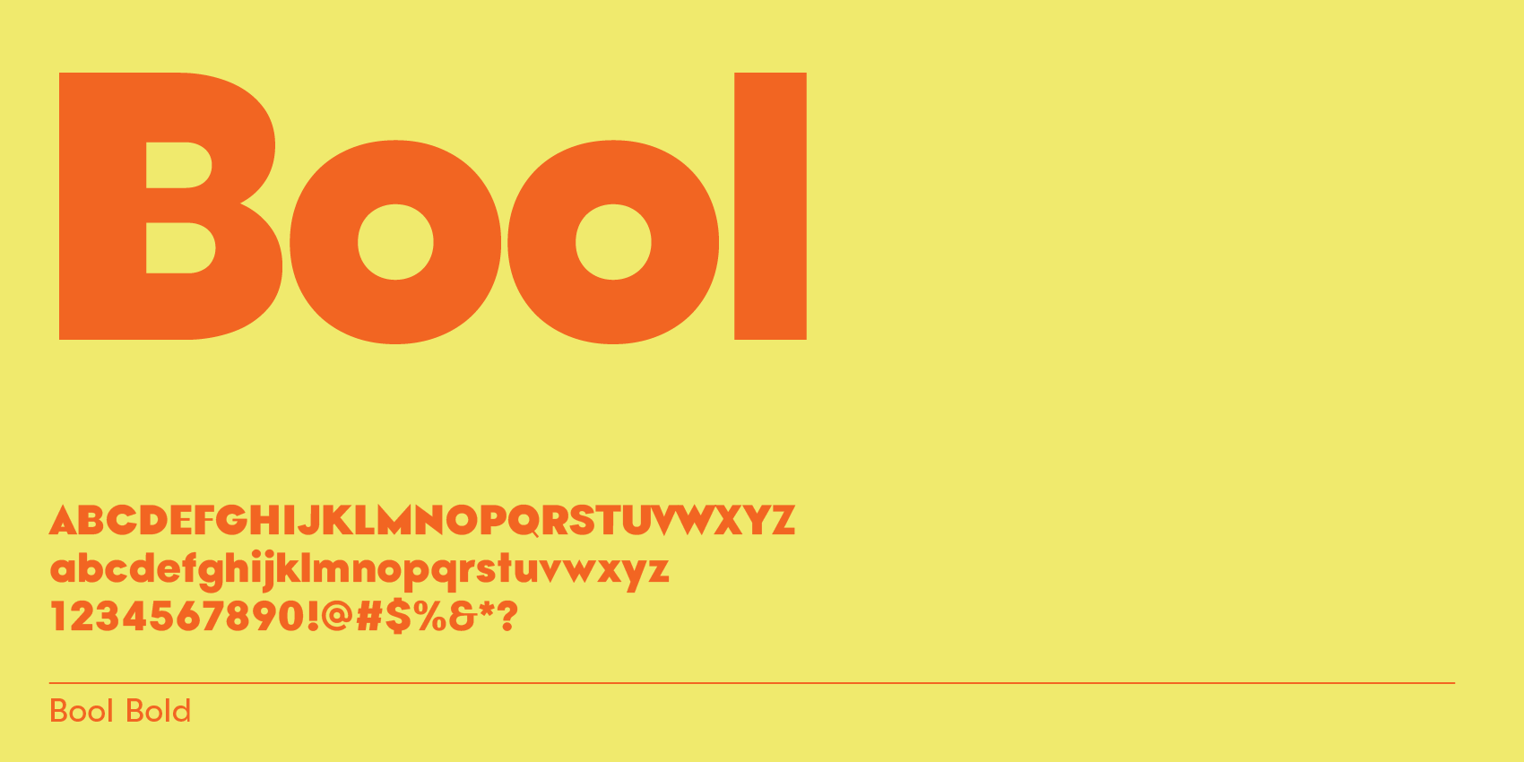
Bool, playful font in bold with thinner horizontal middle bars and pointy tips. 

2. Mosy, modern wide sans-serif with upside-down letter S

Mosy, modern wide sans-serif with upside-down letter S

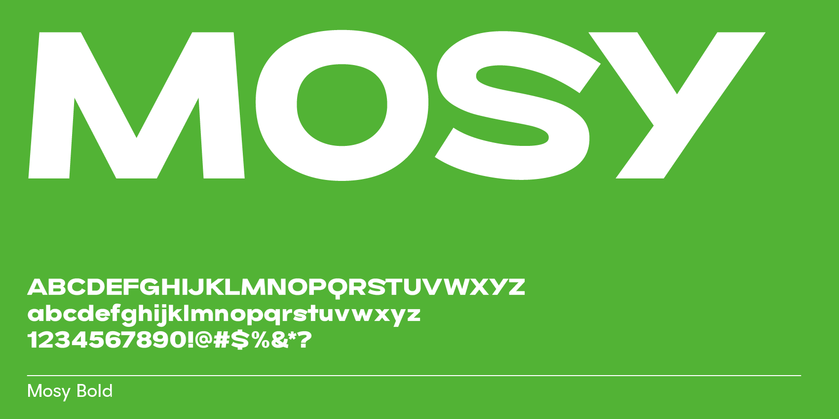
Mosy in Bold, Extrabold and Black. Modern sans-serif font with upside down S and 8 for a fun look.

3. Goji, classic rounded sans with geometric frame for a soft feel in bold

Goji, classic rounded sans with geometric frame for a soft feel in bold

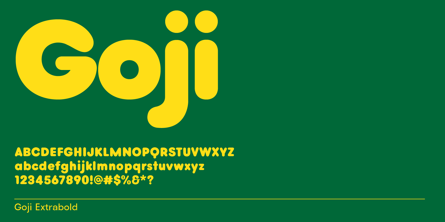
Goji, classic rounded sans-serif font similar to Crocs and Hello Kitty font.

4. Apex, sans-serif font for every type toolkit: sharp tips

Apex, sans-serif font for every type toolkit: sharp tips

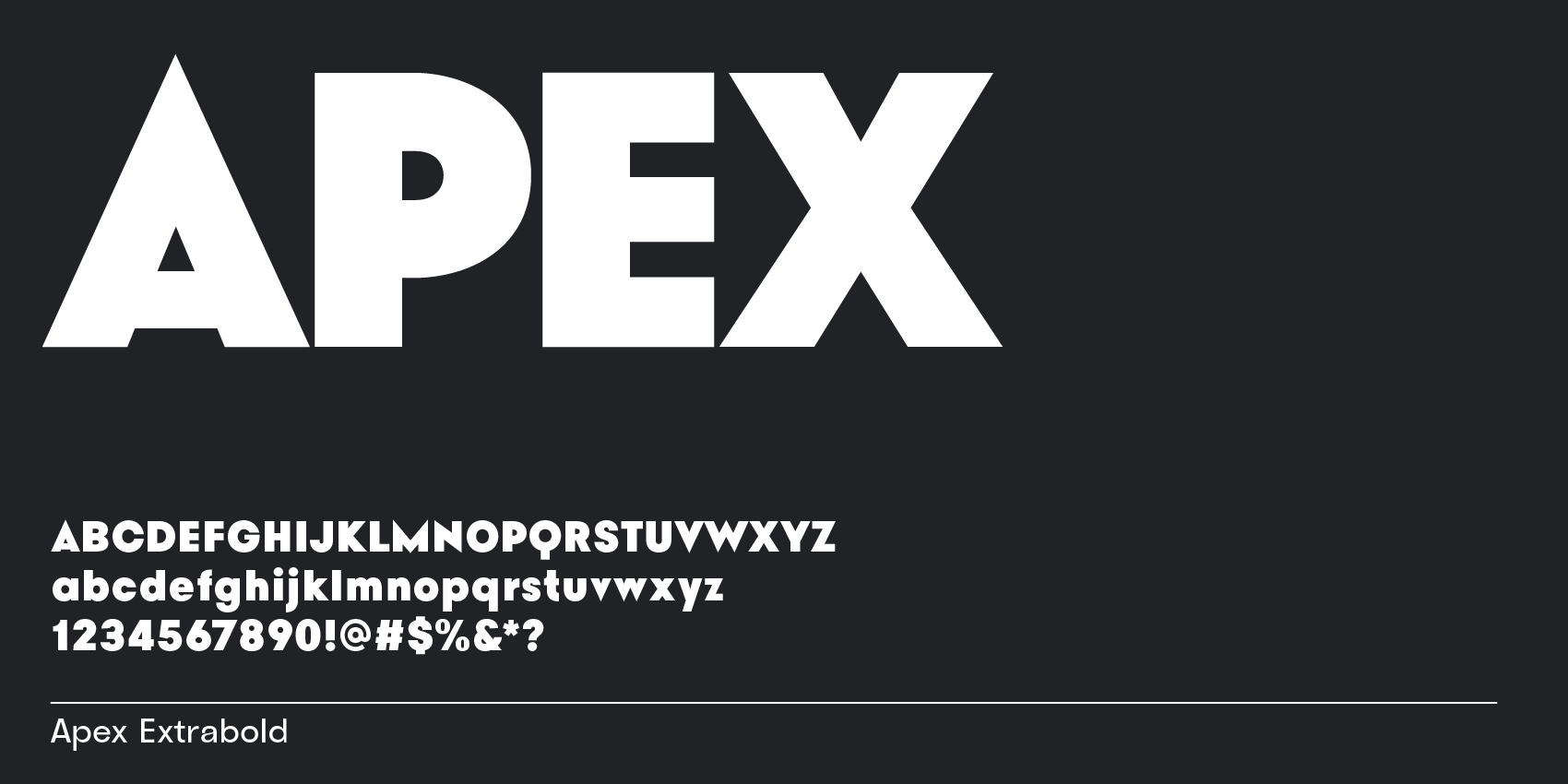
Bauhaus Apex with pointy tips for apex and vertex glyphs.

5. Chez, rounded contrast sans font for a soft feel in bolder weights

Chez, rounded contrast sans font for a soft feel in bolder weights

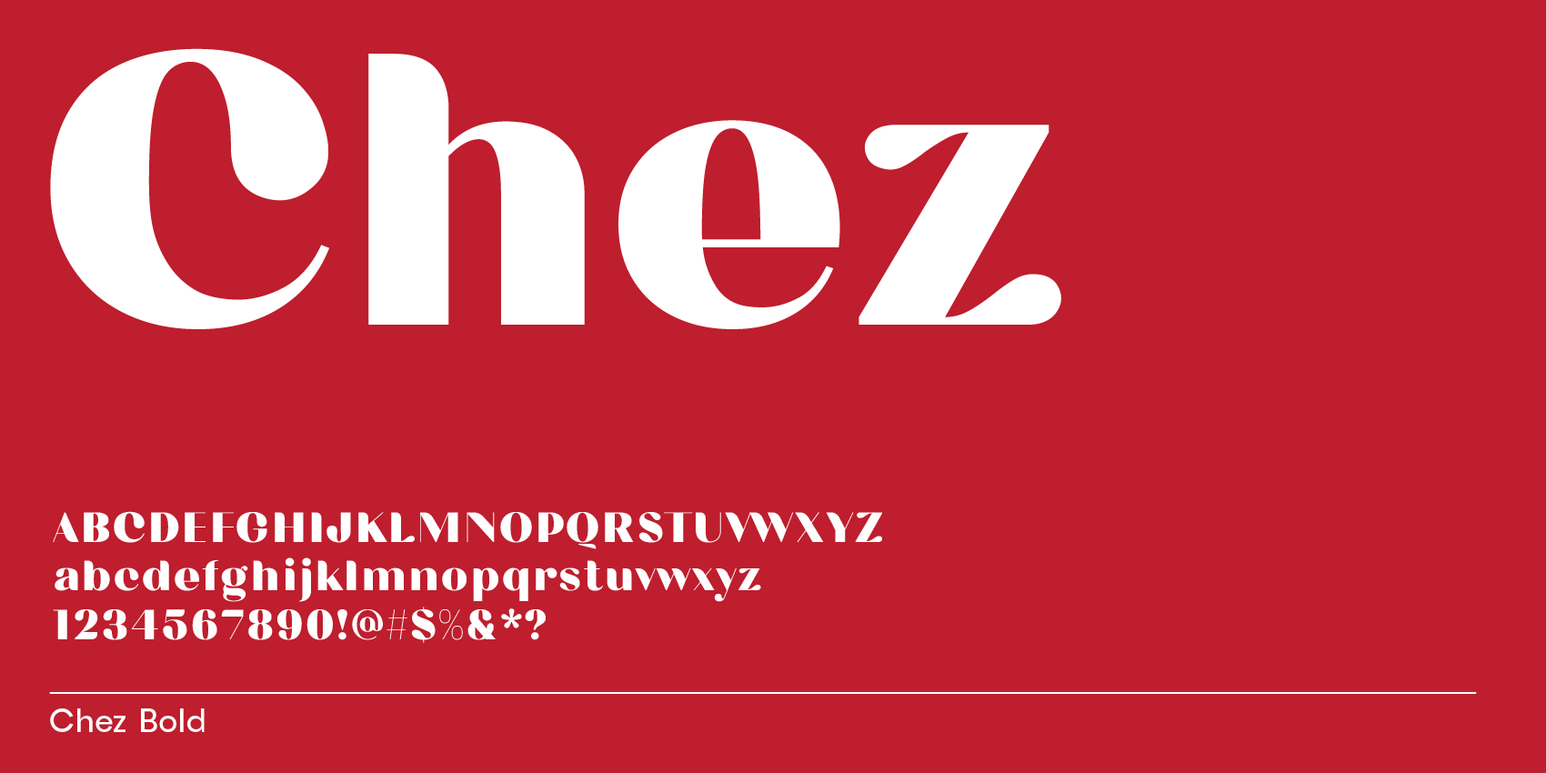
Chez, friendly contrast sans font.

6. Vole, filled-in counters sans for watery look in bold

Vole, filled-in counters sans for watery look in bold

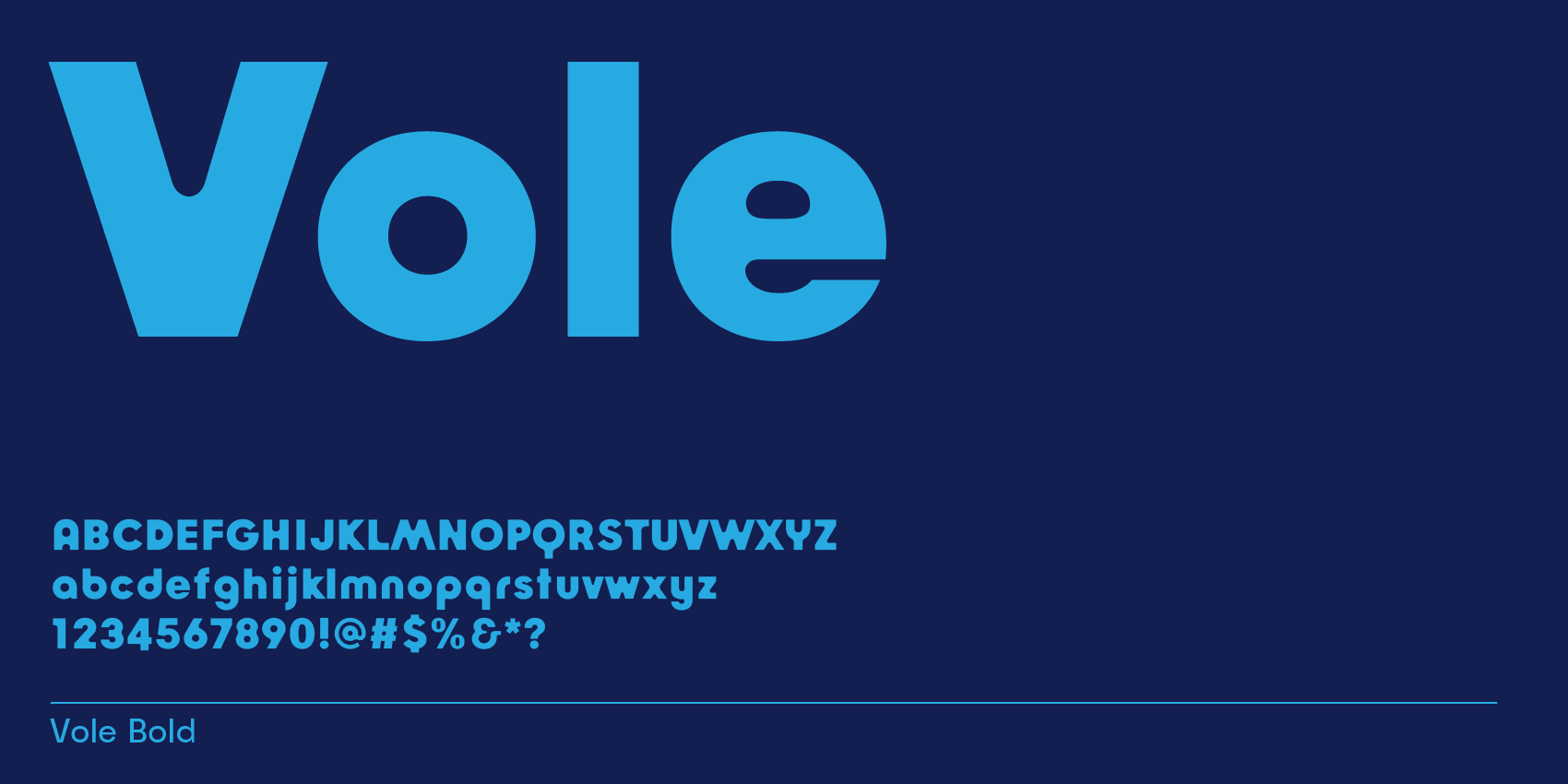
Bauhaus Vole, water font.

7. Anky, Helvetica-style sans font for a bold classic design

Anky, Helvetica-style sans font for a bold classic design

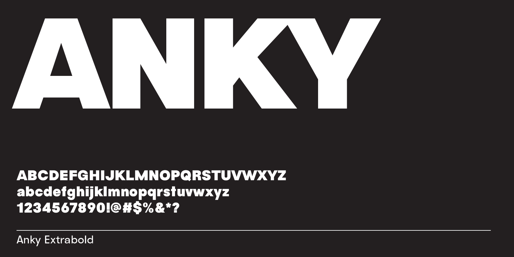
Anky, similar to Helvetica in style.

8. Byrl, wide sans-serif type for a modern slim inktrap look
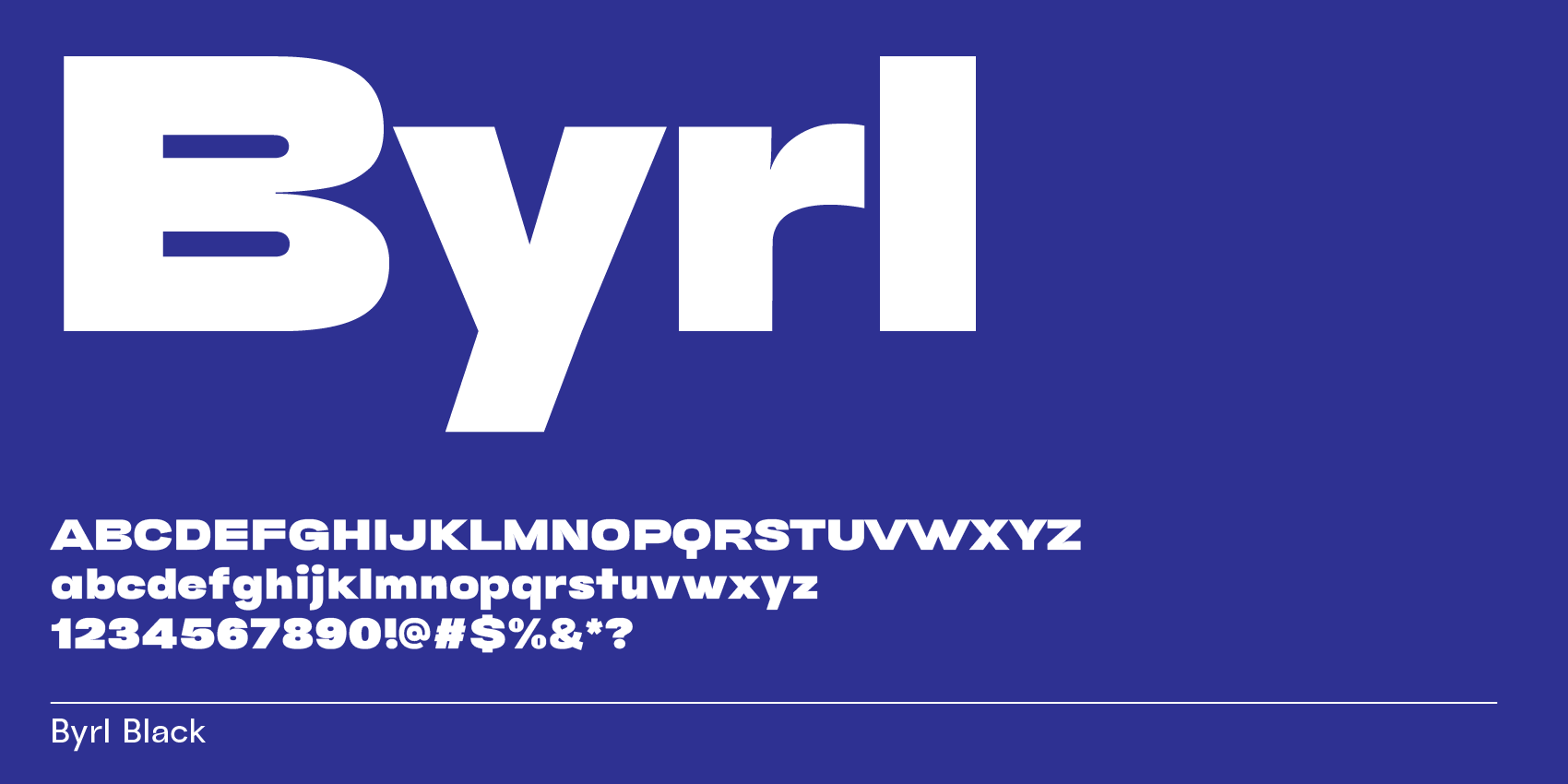
Byrl, wide sans-serif font

Byrl Black.

On design

Bold sans-serifs: Not just loud, but profoundly expressive

Bold sans-serif fonts break stereotypes, revealing depth and personality through design nuances that make each character stand out.

Read more
Font fundamentals: What fonts are best for email marketing?

This article shares the best system fonts for email marketing, balancing brand identity with the technical limitations of popular email clients to improve readability and engagement.

Read more
Where serifs stand strong: these bold serif fonts steal the show

Bold serif fonts blend tradition and modernity, making striking statements in headlines and design elements with their unique personality.

Read more

Cart

Your cart is currently empty.

Start Shopping

Select options