
Serif fonts are typefaces with small decorative strokes — serifs — at the ends of letterforms. They’ve shaped reading for centuries, from Roman inscriptions to today’s editorial typography, and remain a defining choice for brand work that wants to feel considered, refined, or classically elegant.
This list focuses on modern serif fonts: typefaces that keep the elegance of classic serifs but feel cleaner, more open, and more design-forward. They suit beauty and fashion branding, editorial layouts, and logo design where the tone should be refined with a contemporary edge.
Below are our favorite modern serif fonts to test and buy, plus a short list of free Google Fonts with a similarly fresh look. For a quick primer on serif typography itself, skip to What’s a Serif Font?.
Best Modern Serif Fonts For Branding (Including Free Google Fonts)
1. Ques – Elegant Contrast Serif-Style Typeface, Extended And Refined

Ques is an extended humanist contrast font with flared stems that give it a serif-style, calligraphic quality. With stylistic sets and a refined rhythm, it’s a strong pick for beauty, fashion, and elevated branding—working well for logos and readable body copy.
2. Saltz Serif – Sharp Condensed Font For Fashion & Beauty Branding

Saltz Serif is a condensed serif font with sharp terminals and confident curves. The narrow proportions create a tall, editorial rhythm for headlines and short copy, with distinctive pointed cuts and a repeating notch detail that gives the design its signature.
3. Aezra—Sharp Narrow Serif Typeface with Long Terminals

Aezra is a condensed, sharp serif with long, tapering terminals and slim “inky” serifs that are designed to visually connect across letters as you type. The result feels cinematic and slightly gothic, but still refined enough for premium branding, especially when you want a narrow wordmark, a dramatic headline, or a moody campaign look.
It includes alternate glyphs for extra design variety, and it’s available in 9 single weights as well as a full family that includes a variable font.
4. Edde – Strong Serif Font For Craft & Heritage Branding
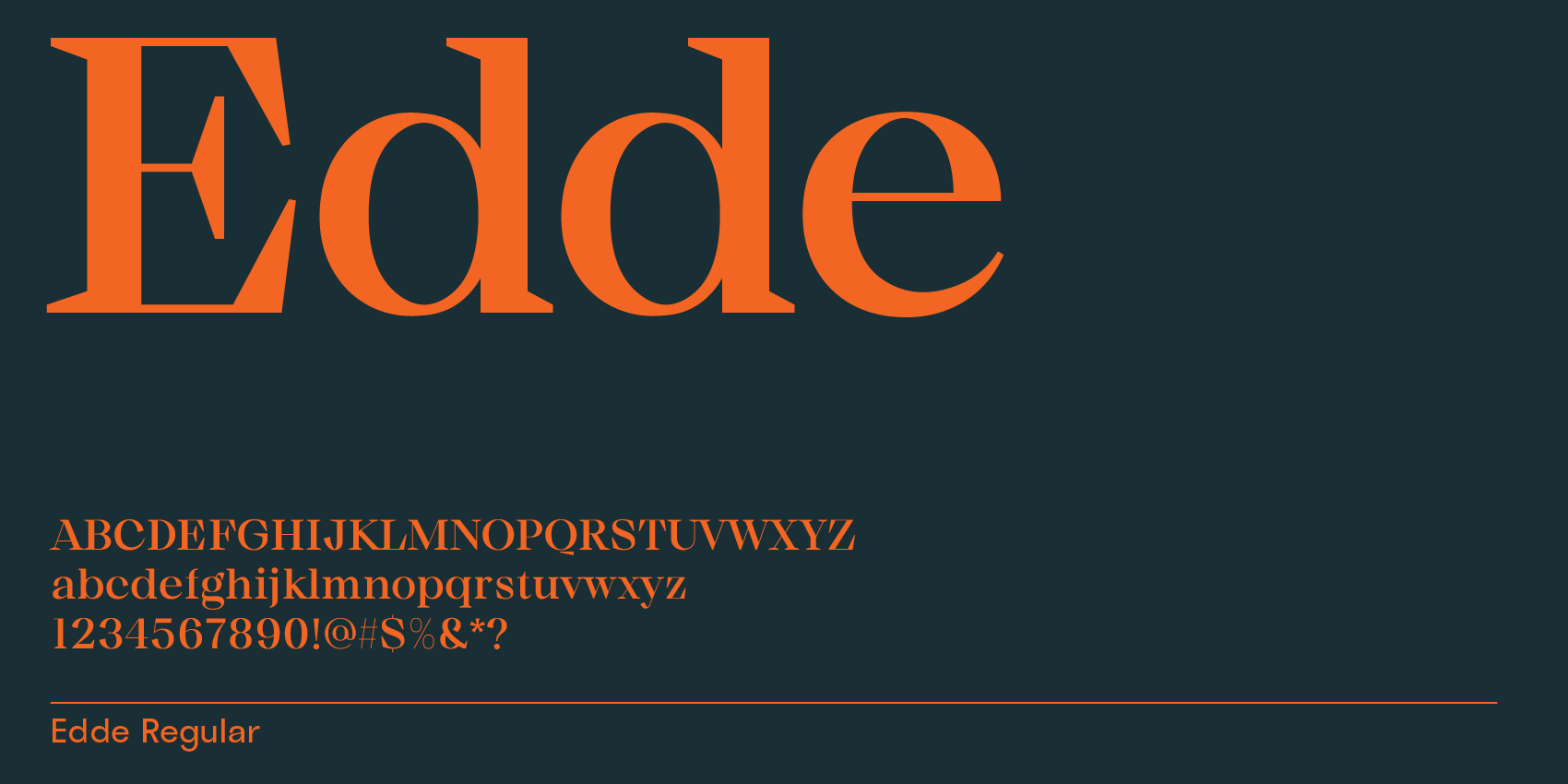
Edde is a bold, characterful serif with confident details that work especially well for craft-focused brands, heritage packaging, and statement wordmarks that need a strong, tactile feel.
5. Bauhaus Soft – Organic Serif Font With Rounded, Voluptuous Details
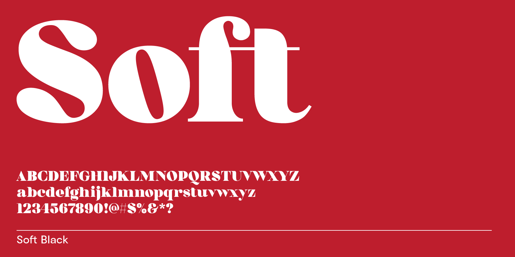
Bauhaus Soft brings a friendlier, more organic mood to modern serifs. Its rounded, voluptuous serifs stand out beautifully in bolder weights, making it a great choice for warm branding, packaging, and expressive headlines.
6. Bauhaus Kijs – Natural Serif With Italic-Like Details And A Handcrafted Feel
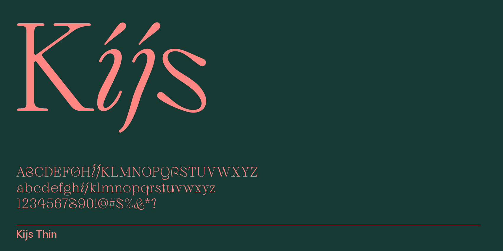
Bauhaus Kijs feels natural and slightly handwritten through its italic-like details (notably in i and j). It’s ideal when you want a modern serif that still feels personal—great for lifestyle branding, artisan products, and editorial layouts.
7. Bauhaus Quil – Modern Quill Serif With A Cool Twist
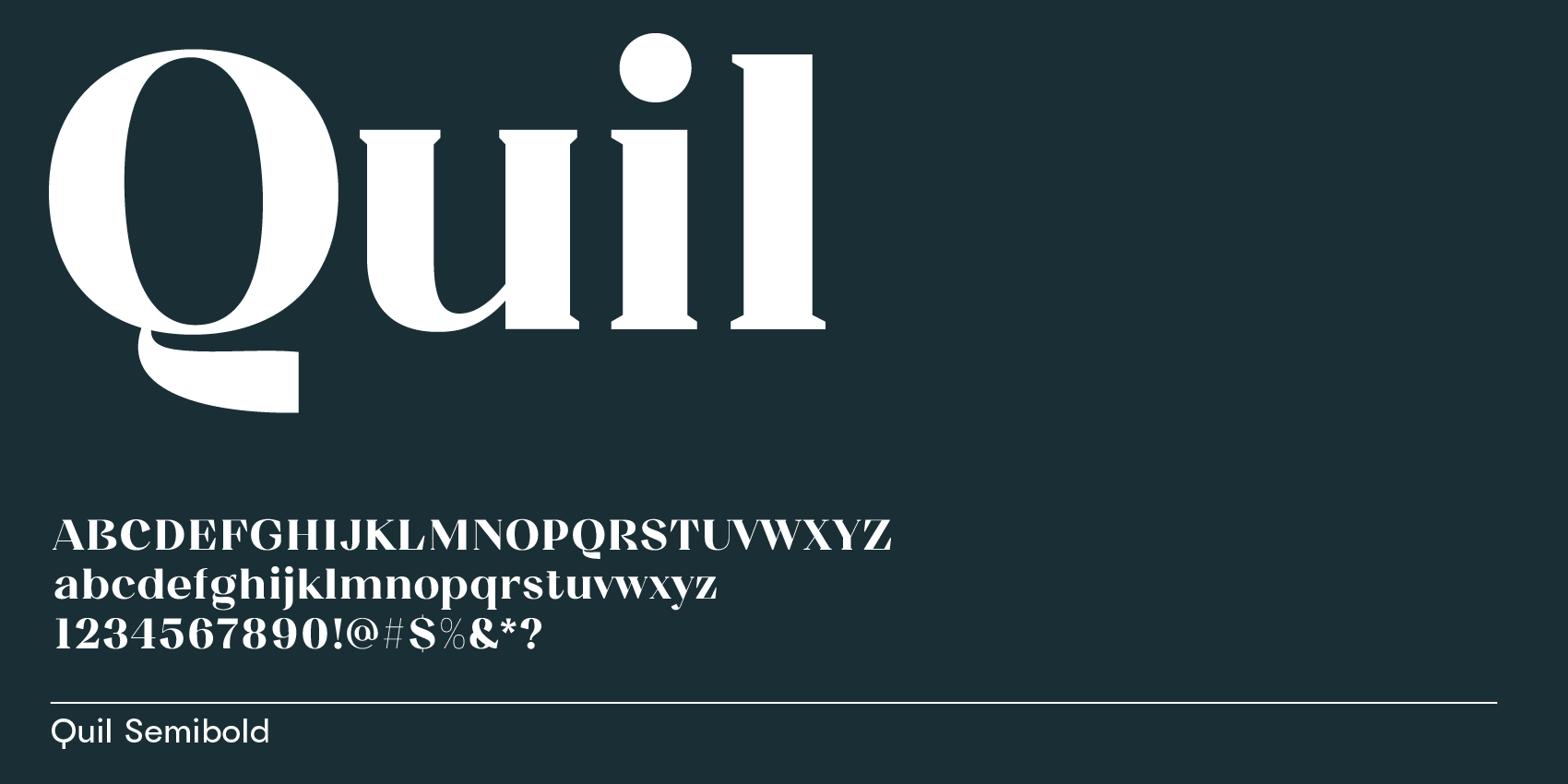
Bauhaus Quil mixes a quill-like spirit with modern shapes and a slightly unexpected serif treatment. Use it for branding that wants to feel confident, creative, and a bit unconventional—especially in display sizes.
8. Rozi – Modern Elegant Serif With Sharp, Pointed Serifs
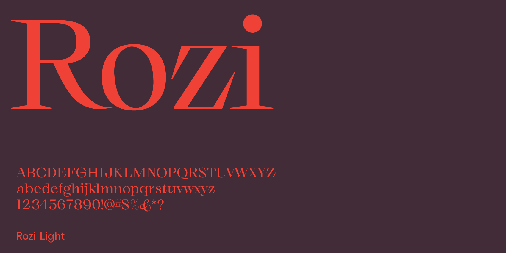
Rozi is a modern elegant serif with sharp, thorny terminals that create a high-end feel. It’s a strong choice for beauty, fashion, jewelry, and premium branding where you want refined contrast and crisp detail.
9. Bauhaus Mod – Modern Serif Typeface With Open, Wide Letterforms
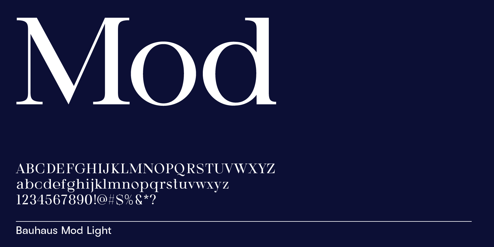
Bauhaus Mod is a modern serif with open counters and wide, generous shapes (notice the openness in o and e). It’s a great fit for clean editorial branding, modern packaging, and design systems that need clarity with a sophisticated serif voice.
Best Free Serif Fonts With A Modern Look
While Google Webfonts has a lot more sans fonts in the modern category, here’s my top list of free modern serif fonts, ordered by most modern first:
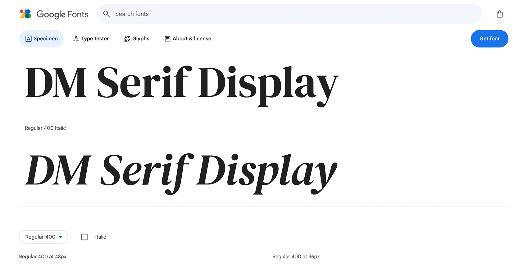
1. DM Serif Display (Also Has A Text Version)
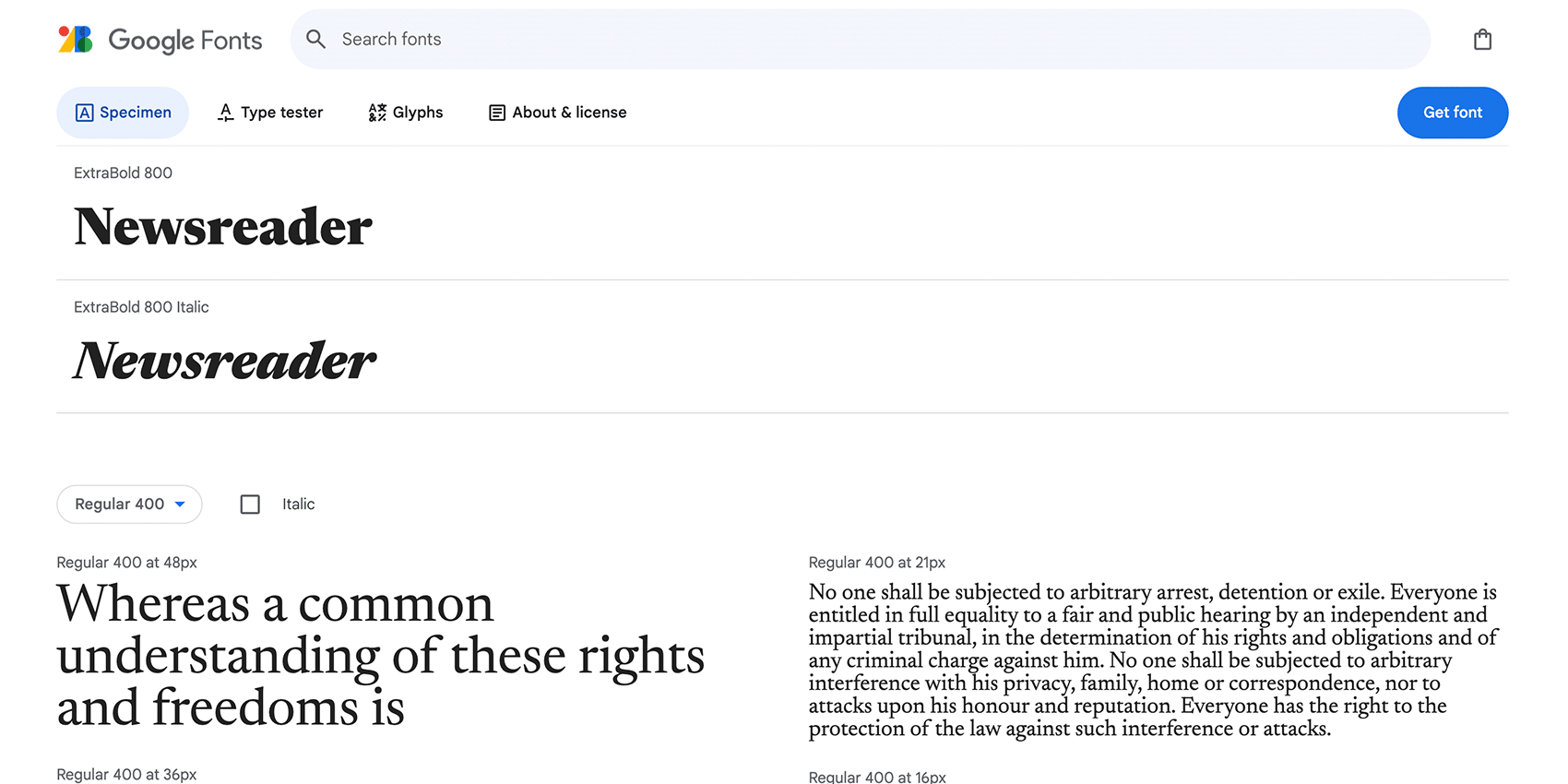
2. Newsreader
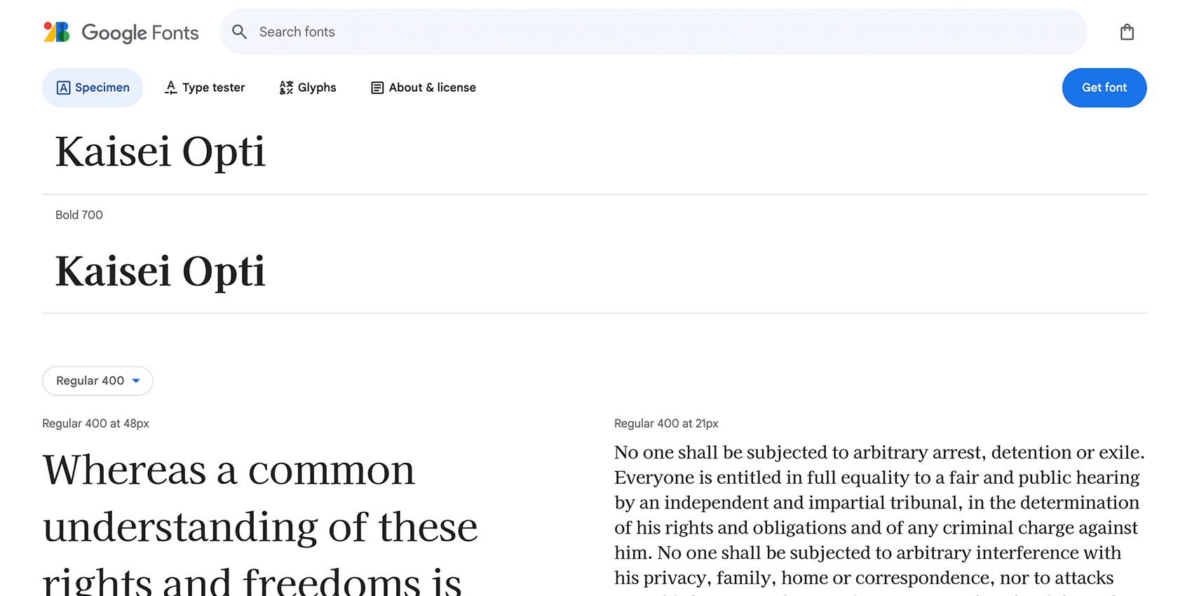
3. Kaisei Opti
What’s a Serif Font?
A typical classification of fonts is serif vs. sans-serif, and sometimes also slab-serif, an in-between version of both featuring short serifs. Briefly, serifs are the little feet at the endings of letter stems.
During the Roman times, these little feet made it easier for stone carvers to carve letters into stone so they could have a smooth finish on all ends. In contrast, sans-serifs only started to become popular in the 1830s.
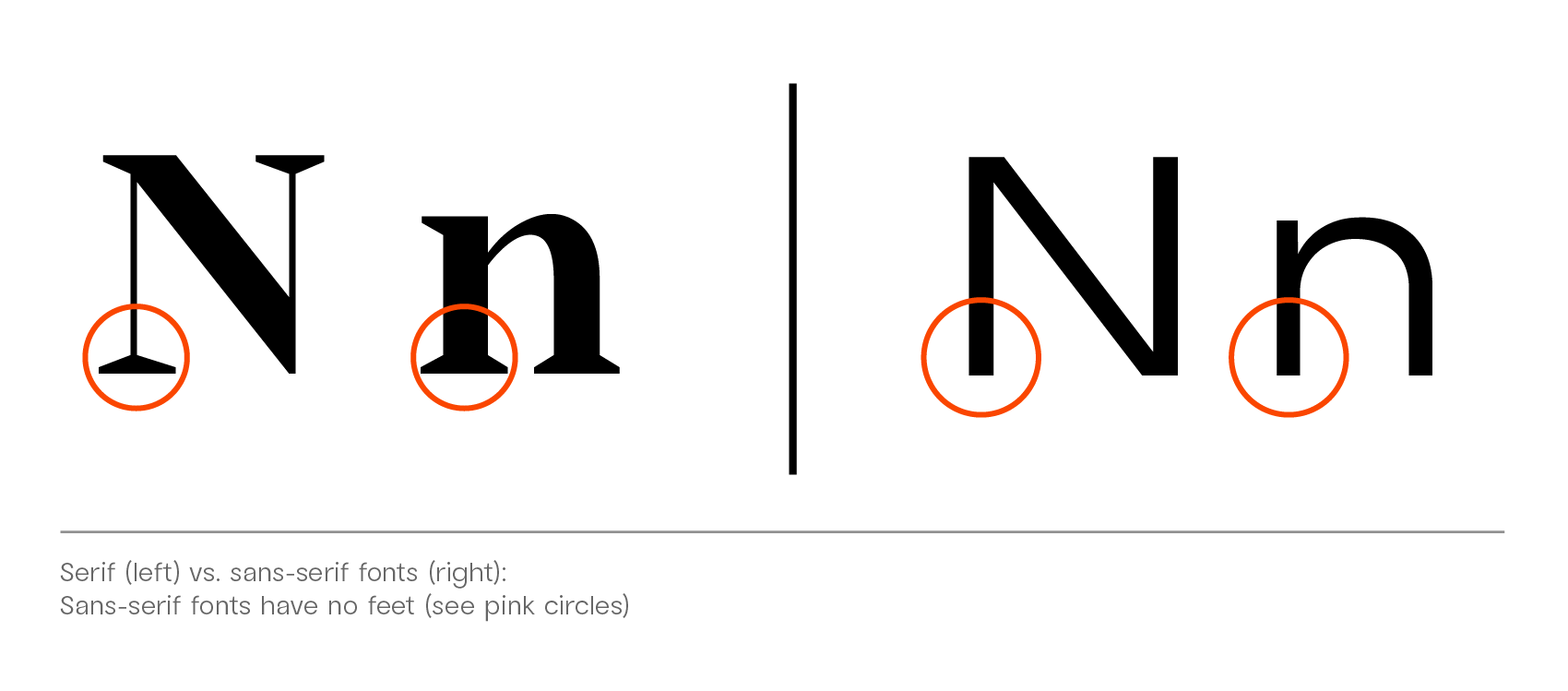
Serif vs. sans-serif font (right).
What Makes A Serif Font Modern?
Serif fonts generally have a more classy, older feel than sans-serif fonts. Serif letters are all we see when we look at old inscriptions, historical books, and images of old writings. Even nowadays, they’re still more often used for text in classic books.
Similar to sans-serif fonts, modern typefaces feature a geometric frame that’s rather squarish than an elongated rectangle; the counters (inner forms of letters) are broader and more open, strokes have a slight handwritten quality with more expansive terminals; x-heights (height of lowercase letters) are often taller than in classic serif fonts, contributing to a more open, generous feel.
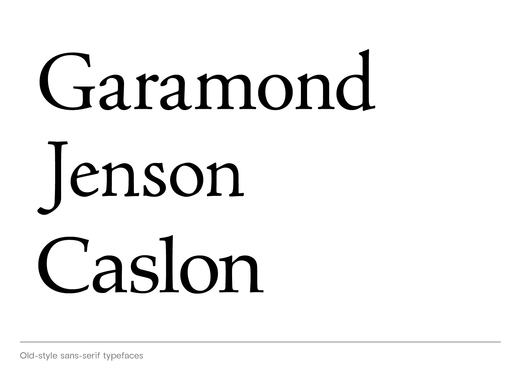
Old-style serif font. Shown here: Garamond, Jenson, and Caslon.
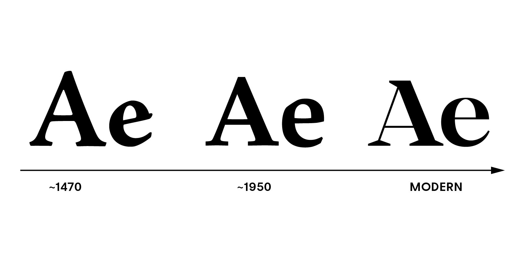
Letterforms from old to modern.
Classic old-style serif fonts feature serifs that are either rounded or have a quill-like quality. They are often fonts for long texts, meaning their contrast between thinner and thicker strokes is less pronounced.
The serifs of modern fonts can be more experimental. They are sharp and pointy (like in Rozi), they are overemphasized (like in Edde), or overly short (like in Quil). Modern serif fonts are open—compare the wide letters o and e from the Bauhaus Mod font.
Modern serif fonts can also relate to the entire typeface and feature a specific characteristic, like the italicized letters i and j in Kijs, giving this font a natural look. Another example is Bauhaus Soft—these serifs are round and voluptuous, especially in their bolder font weights.
Related reading
For more in the modern serif tradition, see our guides on Italian-style fonts, modern Art Deco fonts, and our broader modern typography overview.