Check out this collection of elegant fonts in lighter font weights. These five typefaces have a contemporary style that works well for 2024.

Roma Thin
Roma is a typeface of the contrast category—thin and thick strokes derived from a nib-style pen. This type of design is naturally classy and elegant, and due to the typeface’s open letter forms, it feels modern and friendly.
Little River Light

Little River is a light serif with short, sharp serifs and small notches along the stems. The detailing keeps a very light weight from looking thin and empty at size. Nine weights, Thin to Black, plus a variable font.
It works for fashion and beauty branding, perfume and skincare packaging, and editorial covers.
Walnuss Regular

Walnuss is an expanded serif with short serifs and wide, open counters. The extra width gives a headline presence without heavy strokes. Nine weights plus a variable font.
It suits editorial mastheads, restaurant and hospitality branding, and any layout where a serif has to fill a wide measure.

Quil Extralight
Quil is a typeface with sharply cut serifs that point to a concept of precision and strength. The font gains elegance and finesse when Quil is used in lighter weights. Quil has unique designs—letters B, R, and Q stand out due to their fluid, natural strokes.

Mod Thin
Bauhaus Mod is a modern, wide-open typeface with serifs. Read more about what makes a serif font modern (vs. classy) here.

Slim Extralight
Try Slim, a sans-serif typeface available in nine weights for a friendlier, more approachable elegance. The lighter the weight, the more elegant the design.

Kijs Thin
If you’re looking for a natural feel that reminds people of plants and fluidity, check out Kijs. This typeface features a few letters in italics mixed into the overall look of an educational serif. This style creates a contemporary and unique style.
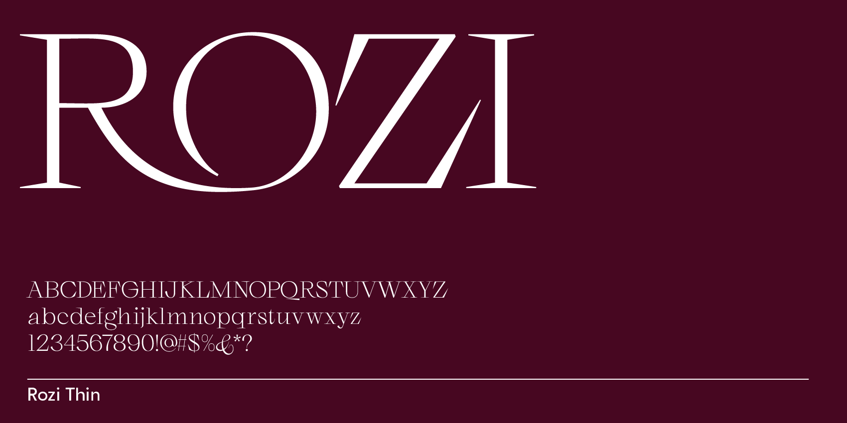
Rozi Thin
Rozi has 9 font weights but it’s most elegant in its lighter weights. It’s a beautiful typeface with very sharp long serifs. Rozi is modern and shows a little bit of witchcraft with its lowercase a and g. The font has ligatures & alternate letters, such as 2 or more options for glyphs A, B, C, G, O & R, to make designs unique.