Fun Fonts
-
Rati, Contemporary Contrast Typeface for Modern Brands Rati, Contemporary Contrast Typeface for Modern Brands
$69.00 USD -
Pout—Fun reverse-contrast font -
Rail—Fun contrast font with thin lines -
Cesty—Friendly Rounded Display Font for Logos and Packaging Cesty—Friendly Rounded Display Font for Logos and Packaging
$69.00 USD -
Skay, Handwritten Bubble Font for Beauty & Fashion Skay, Handwritten Bubble Font for Beauty & Fashion
$39.00 USD -
Miox, Funky Groovy Bubble Font for Trendy Playful Branding Miox, Funky Groovy Bubble Font for Trendy Playful Branding
$69.00 USD -
Vole, Modern Geometric Sans-Serif Font with Rounded Counters Vole, Modern Geometric Sans-Serif Font with Rounded Counters
$69.00 USD -
Lace Rounded—Handwritten Line Font for Playful Designs Lace Rounded—Handwritten Line Font for Playful Designs
$49.00 USD -
Bauhaus Bau—Rounded sans-serif font for modern retro styles Bauhaus Bau—Rounded sans-serif font for modern retro styles
$69.00 USD -
Apex, Bold Sharp Sans-Serif Font for Sports & Confident Brands Apex, Bold Sharp Sans-Serif Font for Sports & Confident Brands
$69.00 USD -
Bool, Funky Playful Sans-Serif Font with Bold Alts Bool, Funky Playful Sans-Serif Font with Bold Alts
$69.00 USD -
Bauhaus Soft, Bold Organic Rounded Serif Font for Branding Bauhaus Soft, Bold Organic Rounded Serif Font for Branding
$69.00 USD -
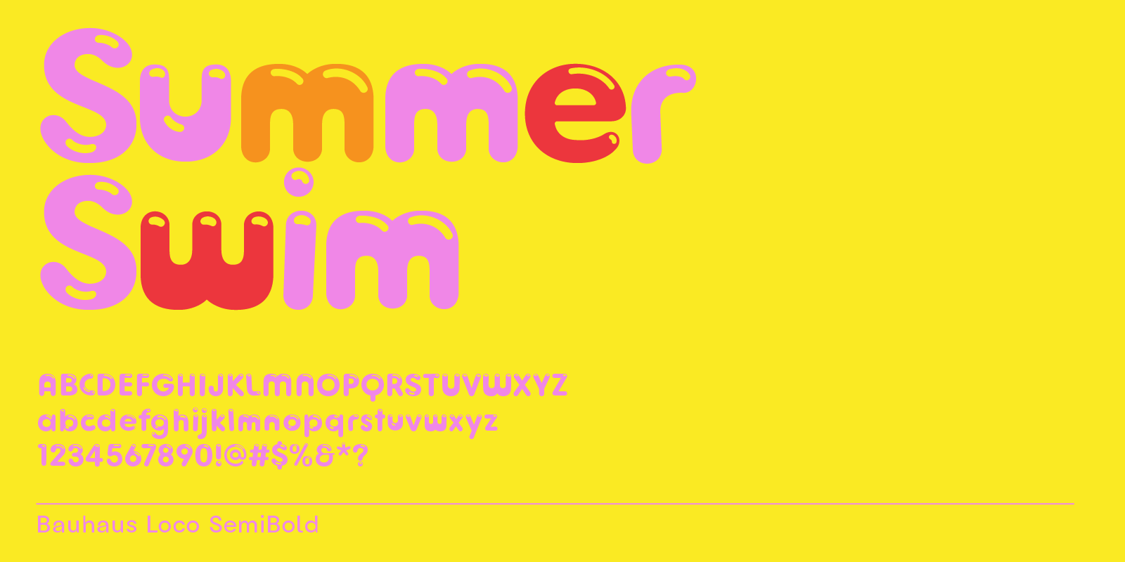
Loco—Bubble font similar to Cocomelon -
Lace—Handwritten line font -
Goji—Playful, Rounded Sans-Serif Font for Friendly Branding Goji—Playful, Rounded Sans-Serif Font for Friendly Branding
$69.00 USD -
Quik—Marker font for fun crafts, food, sports Quik—Marker font for fun crafts, food, sports
$14.00 USD -
Swav, Modern Wavy Futuristic Display Font Swav, Modern Wavy Futuristic Display Font
$119.00 USDSwav, Modern Wavy Futuristic Display Font
$119.00 USD -
Plox—Cool bubble block font with a playful toy box feel Plox—Cool bubble block font with a playful toy box feel
$69.00 USD -
Fun Bubble Font Pack of 6 Fonts SaleFun Bubble Font Pack of 6 Fonts
Regular price $97.00 USD Sale price $39.00 USDFun Bubble Font Pack of 6 Fonts
Sale price $39.00 USD Regular price $97.00 USD -
Kayon—Geometric Tech Font for Gaming and Branding Kayon—Geometric Tech Font for Gaming and Branding
$69.00 USD -
Auria Sans, Airy Modern Sans-Serif Font with Soft Inner Corners Auria Sans, Airy Modern Sans-Serif Font with Soft Inner Corners
$69.00 USD -
Fall Font Pack of 9 Fonts SaleFall Font Pack of 9 Fonts
Regular price $185.00 USD Sale price $59.00 USDFall Font Pack of 9 Fonts
Sale price $59.00 USD Regular price $185.00 USD


Design traits to look for in fun fonts
Fun fonts are an easy way to add more personality to projects, because they often bring their particular energy to a design.
To help you select the right font for your project, there are a few design traits to consider.
The most common trait of fun fonts is their playful, whimsical appearance. They often put an emphasis on curves and creative letterforms that give them a unique look.
Use stylistic sets to make fonts more fun
Fun fonts tend to be distinctive and memorable. On top of that, they can feature alternate letter designs that make them stand out from other typefaces. Some include exaggerated letterforms, interesting flourishes, and other unexpected elements that make them easily recognizable.

In Illustrator, access stylistic sets by double-clicking on a letter. If there are alternate letter designs, they will show up in a little popup below the text box.
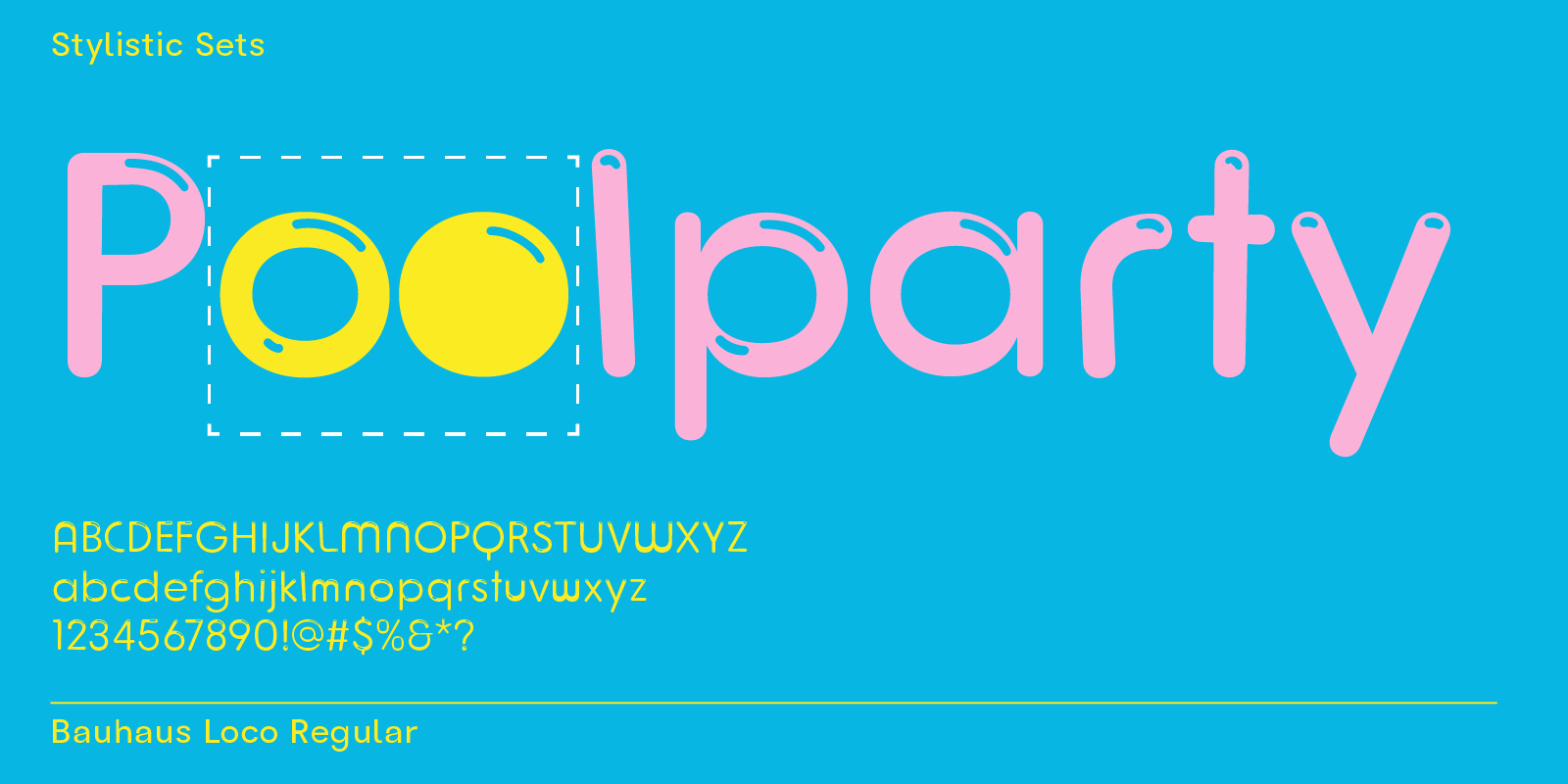
Summer posters can be fun and maintain a minimal look by picking an easy bubble font like Loco. These letters stand out through their 3D highlight effect and occasional heavy top or bottom weight, e.g., letters m and w.
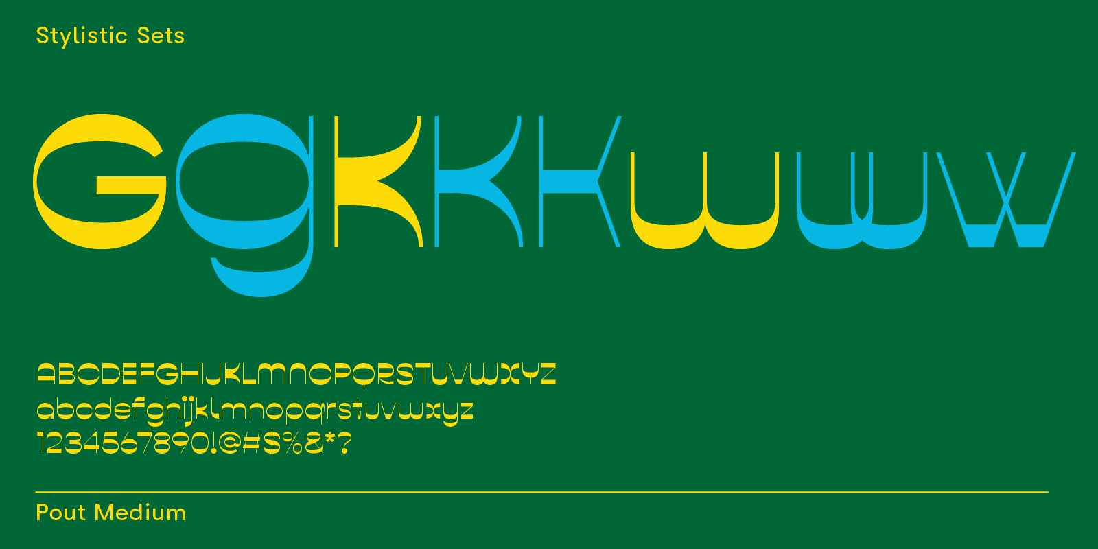
Pout is a reverse-contrast font with lots of alternate letter designs. Check out letters G, K, and w in the image above.

Bool is a sans-serif typeface that includes cool alt letters to make logotype and headlines look unique in a few clicks.
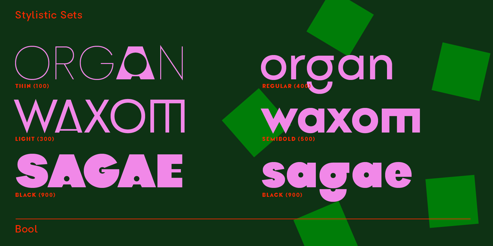
Same typeface, more options—Bool makes it easy to design cool posters. The font has nine font weights, making it a versatile font to include in a fun font collection.
Fun-looking numbers
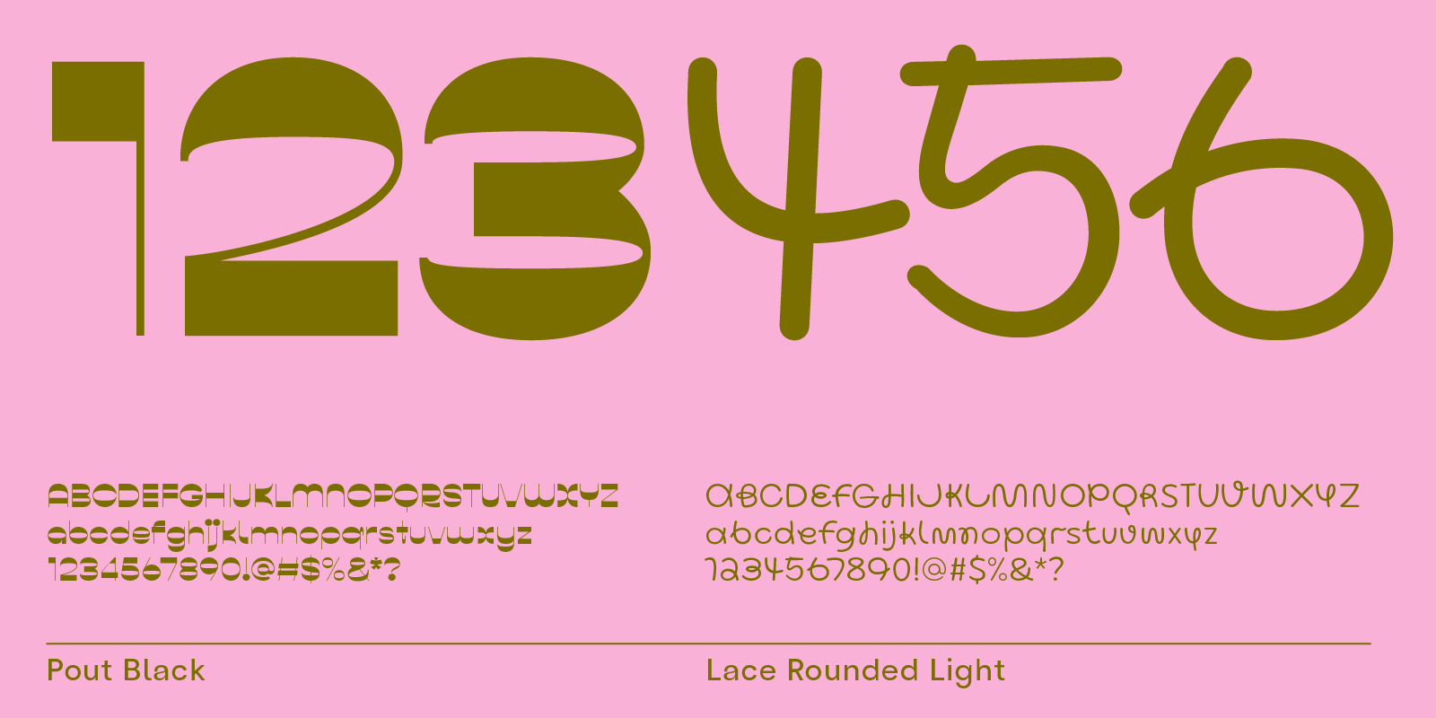
Fun numbers add immediate playfulness to any text. Pout’s numbers look modern in bold, Lace’s numbers are cute and handwritten.
Simple design adjustments for different looks
Posters, school flyers, party invitations—many fonts are more versatile than you think at first glance.
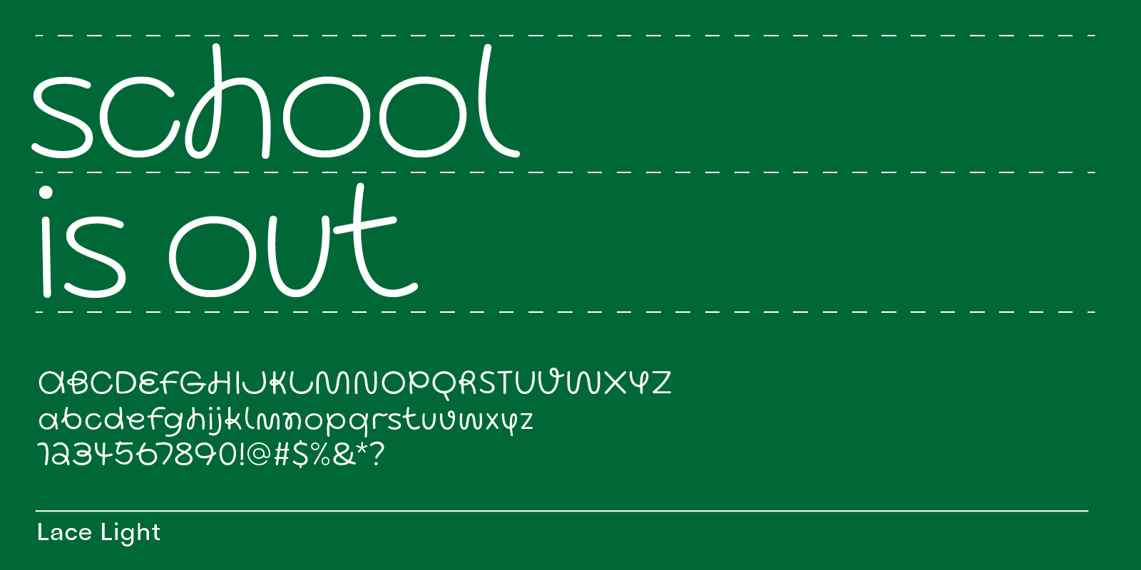
Lace comes as a rounded version, too. This geometric handwritten typeface looks fun when paired with a school color palette, such as a darker green and white.
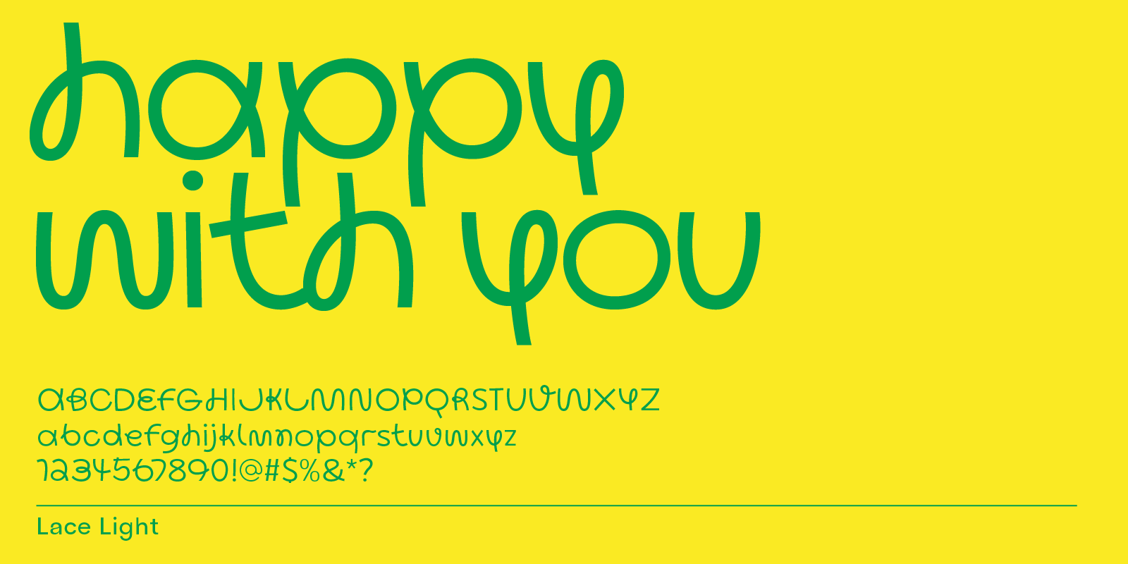
The same typeface, two different font weights and text settings. Above, you see Lace in the Light weight, set in lowercase letters. This makes text look friendlier and cute.

Lace SemiBold set in uppercase letters has more logo character, looks a bit cooler, and works well for poster headlines.
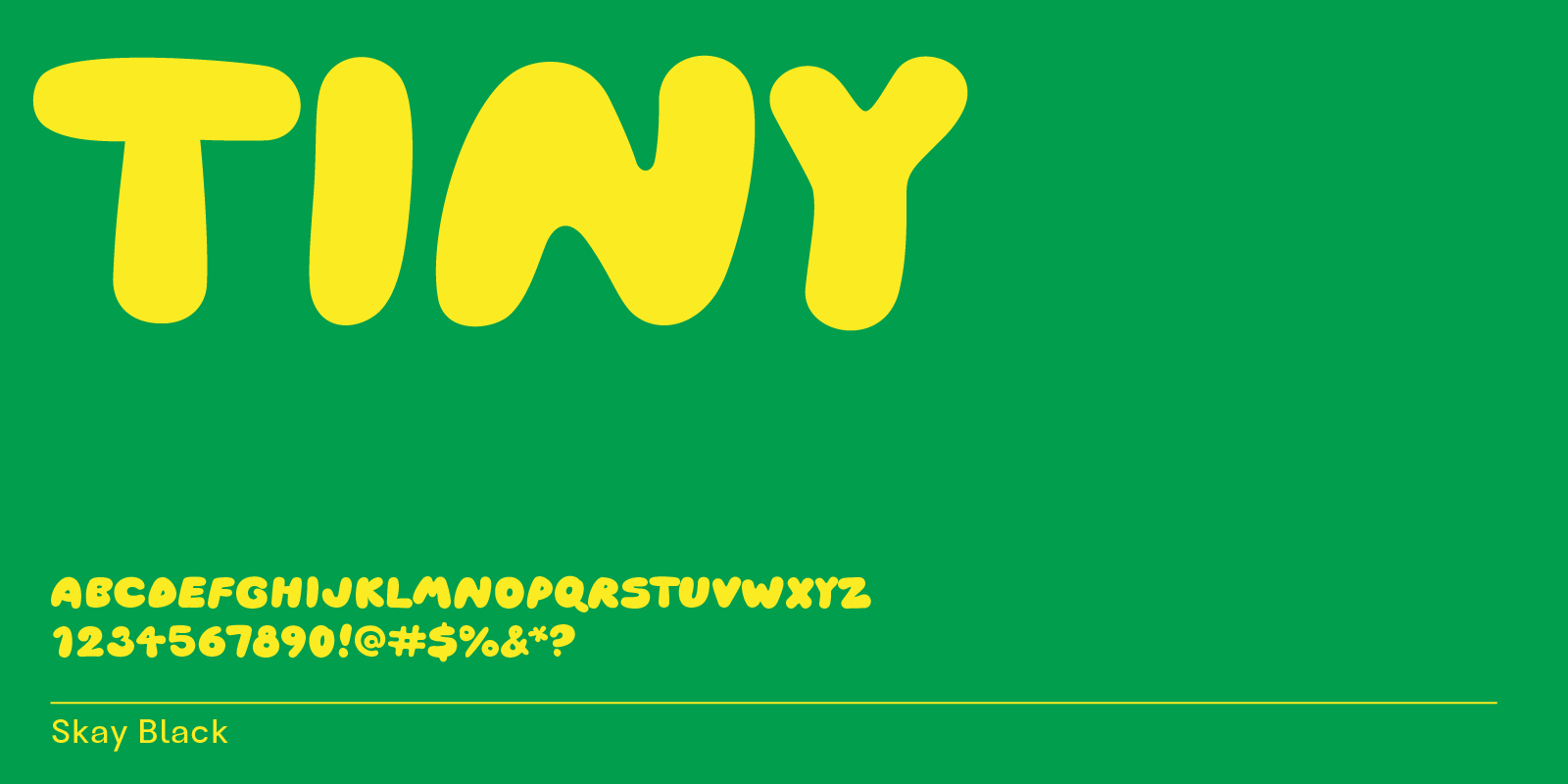
Skay has only uppercase letters, perfect for logo and headline design.

