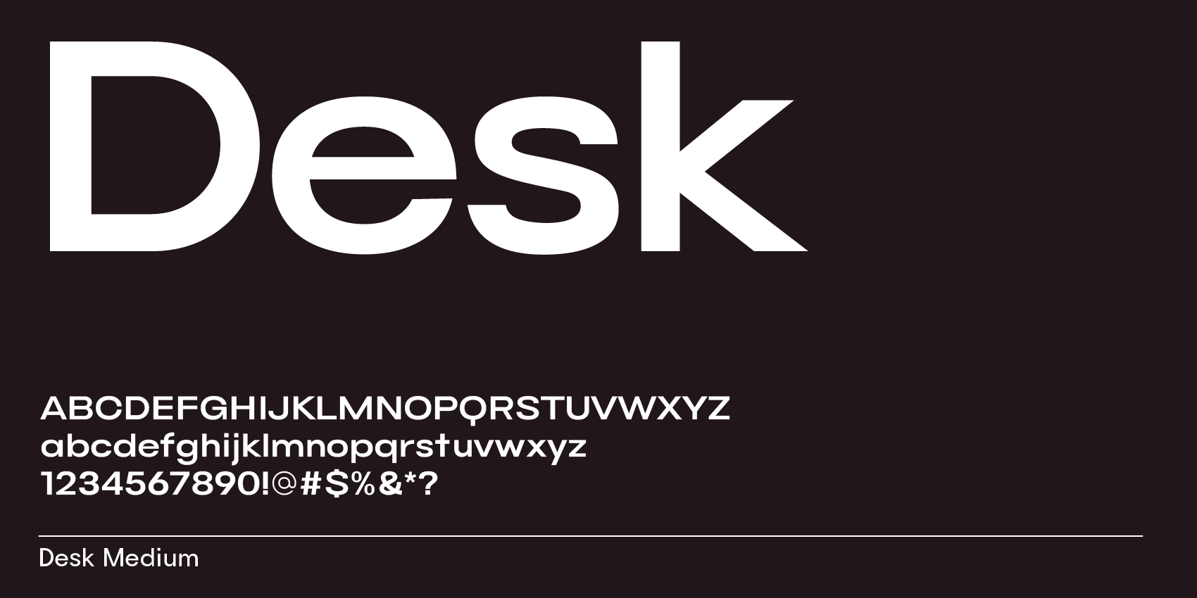
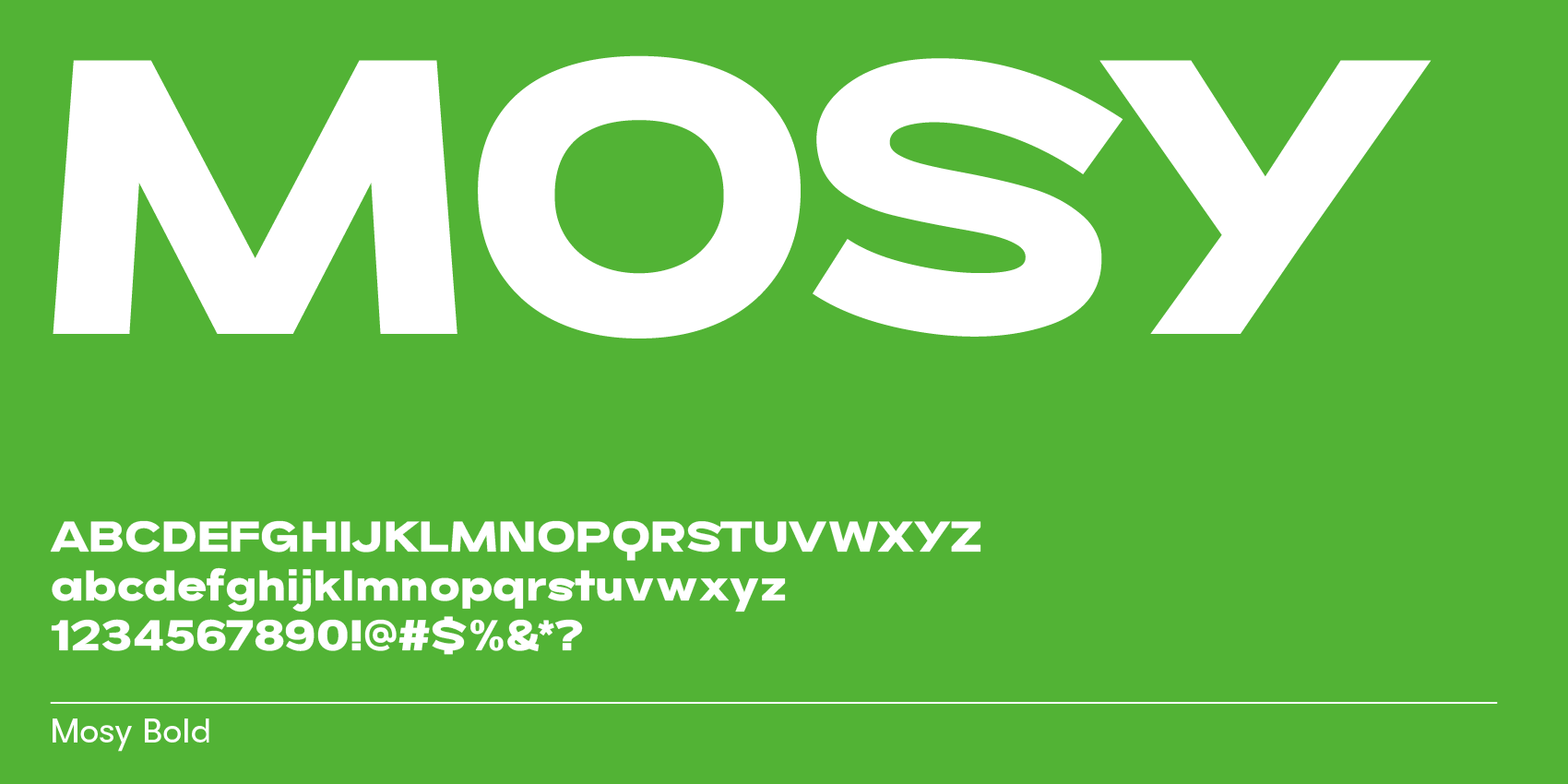
Chanel uses a custom sans serif font called AB Chanel Corpo (web version). The logo is set in all caps with extra spacing, giving it a bit more air and an elegant feel. The font is wider than normal, which adds a modern, designy look. Using a sans serif makes the brand feel clean and straightforward, while the extended width adds a contemporary quality. The all-caps layout creates a compact, label-like block and makes the wordmark more of a unit.


The C and S have angled endings instead of straight ones, and the tips of the letters are flat, not sharp.


