
Playful fonts are usually display fonts: not always the easiest to read at small sizes, but full of personality. They’re great for logos because they’re memorable—often with details that make people look twice.
They’re especially useful for campaigns and one-off projects. Sometimes a single typeface is enough to kick off a concept: set it large, treat it like an illustration, and pull a design idea from what makes it unique—contrast, round counters, or bent corners. Use that idea elsewhere in the layout to tie everything together.
Check out the fonts below. One of them might be just right for what you’re working on. And if you want to share what you’ve made or have a question, email me at saskia@mojomox.com. Or browse the full Playful Fonts collection for more.
Playful Fonts: When You Want Your Type To Say Something
1. Plox – Cool Bubble Block Font With A Playful Toy Feel, Great for Logos

Plox is a bold, bubble block font with a playful, toy box feel. Built from rounded chunky shapes with a modular structure, it’s great for logos, games, and anything that needs a cool and unique look. Best for kids brands, toy packaging, fun apps, and display use like logos, titles, and headlines. Comes with many alternate letters. Available as a full family with variable font and as single font weights.
2. Bool – Playful Display Sans With Alternate Letters

Bool is a playful sans-serif display font with many alternate letter designs. In the example above, you’re looking at different B letters—swap alternates in a logo to dial up character and make the wordmark feel more custom.
3. Pout – Wild Reverse-Contrast Display Typeface

If you’re going for a look that’s more on the wild side, try Pout, a reverse-contrast typeface. We usually know this style from Western movies, but this one is sans-serif—making it modern and playful. Since the visual weight sits at the top and bottom, vertical stems become thin and horizontal bars get bold. The i-dots are round and full, creating tension and memorability.
4. Vole Display – Soft, Approachable Shapes With Fluid Counters

Vole Display looks fairly standard at first glance, but the design is very playful: slanted stems (see M and W), fully rounded shapes, and overly rounded counters make it approachable and fun. Try heavier weights with tighter spacing for a more fluid, wavy feel.
5. Cesty – Playful 70s-Style Contrast Font (Includes Variable Font)

Cesty is a modern 70s-style font that feels playful but still design-forward. Great for logos, food and lifestyle branding, and headline moments where you want charm without looking messy.
6. Rati – Friendly Sans Serif For Modern, Edgy Branding

Rati is a friendly sans-serif with a cool, slightly edgy voice. Use it for branding that wants to feel modern and approachable, with enough character to stand out in logos and short display copy.
7. Lace – Hand-Drawn Monolinear Type For Playful Wedding And Event Design

Wedding fonts are often elegant serifs or handwritten display fonts. If you want something playful but still tasteful, Lace is a strong pick: a monolinear handwritten typeface with multiple weights, letting you dial the mood from refined (thinner) to more kid-like (bolder). It also comes in a rounded version.
8. Rail – Elegant Contrast Type With A Playful Twist

Rail is a unique typeface that creates elegant text elements with a playful twist. A thin connecting stem bonds thicker strokes, communicating connection and craft. Rounded, geometric shapes keep it modern—great for branding, packaging, and editorial-style logos.
9. Kijs – Casual-But-Elegant Serif With Playful Cursive Details

Kijs is casual but elegant in lighter weights, and playful in bolder ones. Partial cursive details (notably in i and j) create a natural, retro-fun look. It’s easy to install for Figma and other design apps.
10. Bauhaus Mod – Trendy Bold Serif With Curvy Serifs And Sweeping Terminals
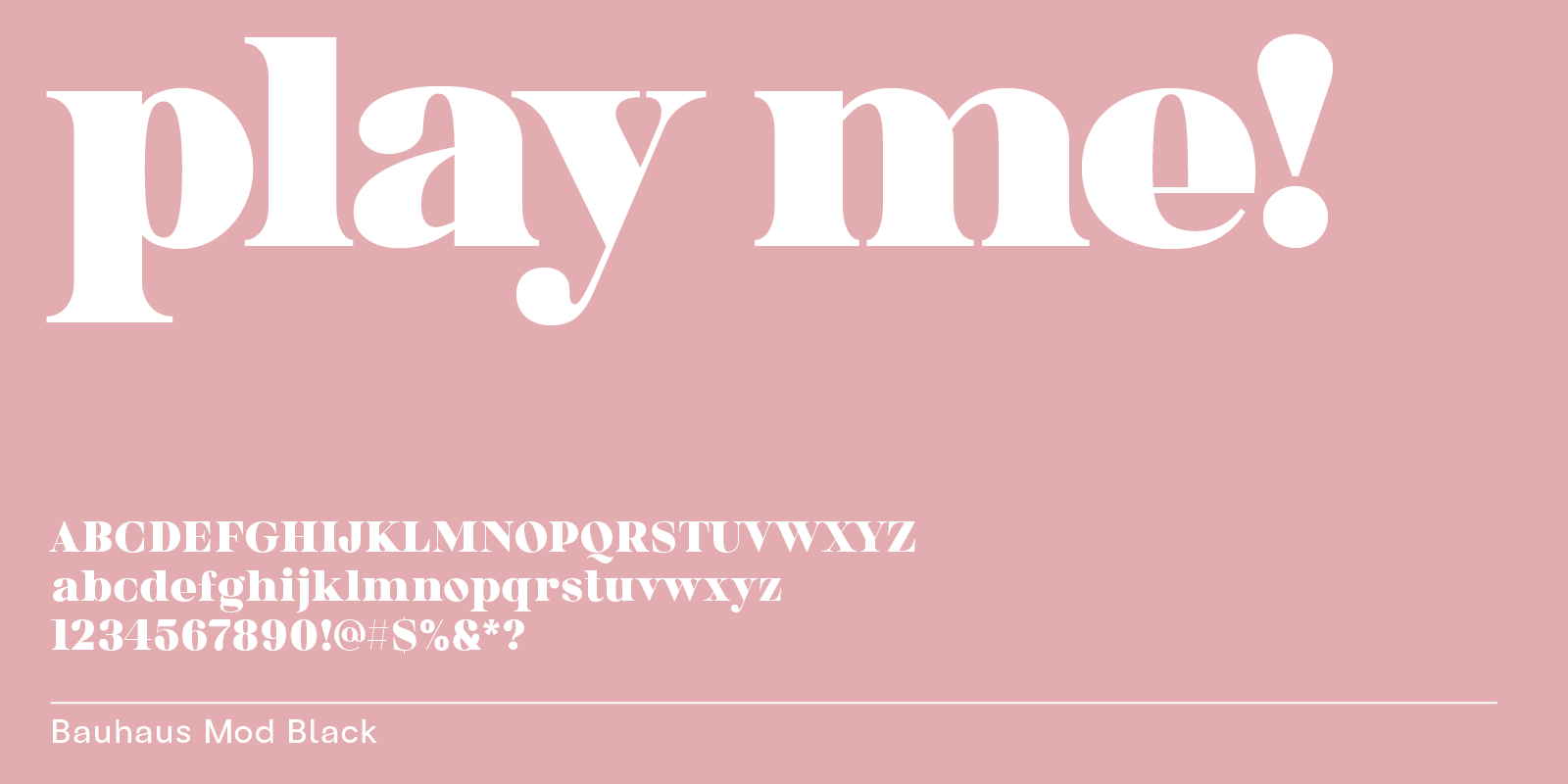
Bauhaus Mod is a bold serif that feels playful through its sweeping terminals, curvy serifs, and compact shapes—especially in heavier weights. A great pick for trendy branding, headlines, and statement packaging.
11. Skay – Organic Bubble Type For Ultimate Playfulness

Bubble fonts come in all styles and shapes. Skay is an uppercase-only bubble typeface with full, fluid forms—perfect when you want logos and headlines to feel soft, bold, and curvy.
12. Loco – Bubble Font With Built-In Highlights For A 3D Effect

Loco is similar to the logo font seen on the Cocomelon show. Some letters are heavier (like M and N), some are tilted (like c and l), and the built-in highlight strip creates a playful 3D effect for maximum impact in kids and entertainment-style designs.
Free Google Fonts
If you’re looking for straightforward web integration, free options for Canva, or quick mockups, check out these playful Google fonts too:
– Borel is a handwriting typeface featuring a school look.
– Caprasimo is a rounded, bold serif font that nods to the 70s.
– Titan One is a fun, modern bubble font.
All of the Google fonts listed above only have one free style—it’s best to use them for display text such as headlines.
Check out our fun collection if you want more ideas for playful designs.
Related reading
For more playful directions, see our funky fonts guide and our trendy fonts 2026 roundup.