
If you’re looking for fun fonts for creative projects, logos, packaging, or social media graphics, this list highlights typefaces with a genuinely happy personality. From bold pointy styles and rounded bubble fonts to quirky reverse-contrast and handwritten designs, these fun fonts help your message feel more playful, friendly, and memorable.
Below, you’ll find 12 of our favorite fun display fonts, with tips on when to use each one and how they can support your brand or project.
1. Bool, bold pointy fun font

The Bool is different from regular fun fonts. At first sight, this type looks relatively geometric, but let’s take a closer look.
Some of the font’s counters are shifted, e.g., the letter B’s counters are closer toward the center and the right, which gives it a bit of a cross-eyed, fun look. The middle crossbars are thinner than the overall stroke width, giving the type a cool cartoon character.
Examples are the letters G, E, and F. Finally, the A’s crossbar is lower than usual, making it a friendly typeface. These fun characteristics are more pronounced in the bolder font weights, from SemiBold to Black.
2. Lace font, monolinear handwriting-style fun font

Lace is a typeface in handwriting style. The thinner font weights, such as ExtraLight and Light, have a pen quality, whereas the bolder styles feature a marker-style stroke.
Each letter is drawn in one line (monolinear style) creating fun loops.
Many of the letters of this typeface end in an upward stroke which creates a friendly appearance.
There’s also a rounded version, Lace Rounded, of this font available.
3. Sway, futuristic wavy fun font

The Sway font is a complete alphabet in uppercase letters only. This type is excellent for display text on posters but not particularly easy to read as body copy. Sway has a funky, futuristic style but, at the same time, looks modern and fun. Sway’s letters are set in particular angles, giving letters a design pattern that makes them easy to use for logos.
4. Vole, fun water-style type

Vole is a typeface in upper and lowercase letters, including the extended Latin alphabet. Its primary design feature is the rounded counters that allow the strokes to bleed into each other, giving the type a bit of an ink character.
It is overall a geometric font with a Bauhaus font aesthetic. For example, the letters b, g, n, and r are missing the usually extended stems, adding to the rounded and fun feel throughout the typeface.
Vole is great for kids’ branding and especially cute when set in all lowercase.
5. Bau, modular rounded fun font

The Bau font is the predecessor font for Vole (see above). The typeface’s letters are based on circles, giving it a modular and fun quality.
Its i-dots are larger than standard dots, which adds to the friendliness of the design. Check out all nice font weights from super thin to very bold here.
6. Skay, uppercase bubble fun font

Skay is another handwriting-style font that comes in nine weights. Especially its bolder weights are considered fun and friendly, in addition to having an organic personality. One famous example that uses this type of font is the Skims logo.
This type only has uppercase letters and numbers and is part of the bubble font family.
7. Slye, center-cut fun font

This type is not easy to read as text, but it’s cool and different. A font like Slye is great for logotype, posters, and headlines. It showcases a personality that wants to be bold and stand out.
It’s fun to mix this font with another font. For example, if you want a specific letter to stand out more or communicate an aspect of “being split” or “different,” then this is an original choice.
8. Pout, sans reverse-contrast fun type

Reverse-contrast fonts have become popular over the past five years, and Pout is part of that font design category. Reverse-contrast fonts are those whose strokes are thicker on the horizontal axis; usually, it’s the opposite and the vertical strokes are bolder.
The reversed design gives this font a quirky look, making it the perfect choice for logos and fun titles.
9. Rail, geometric friendly type

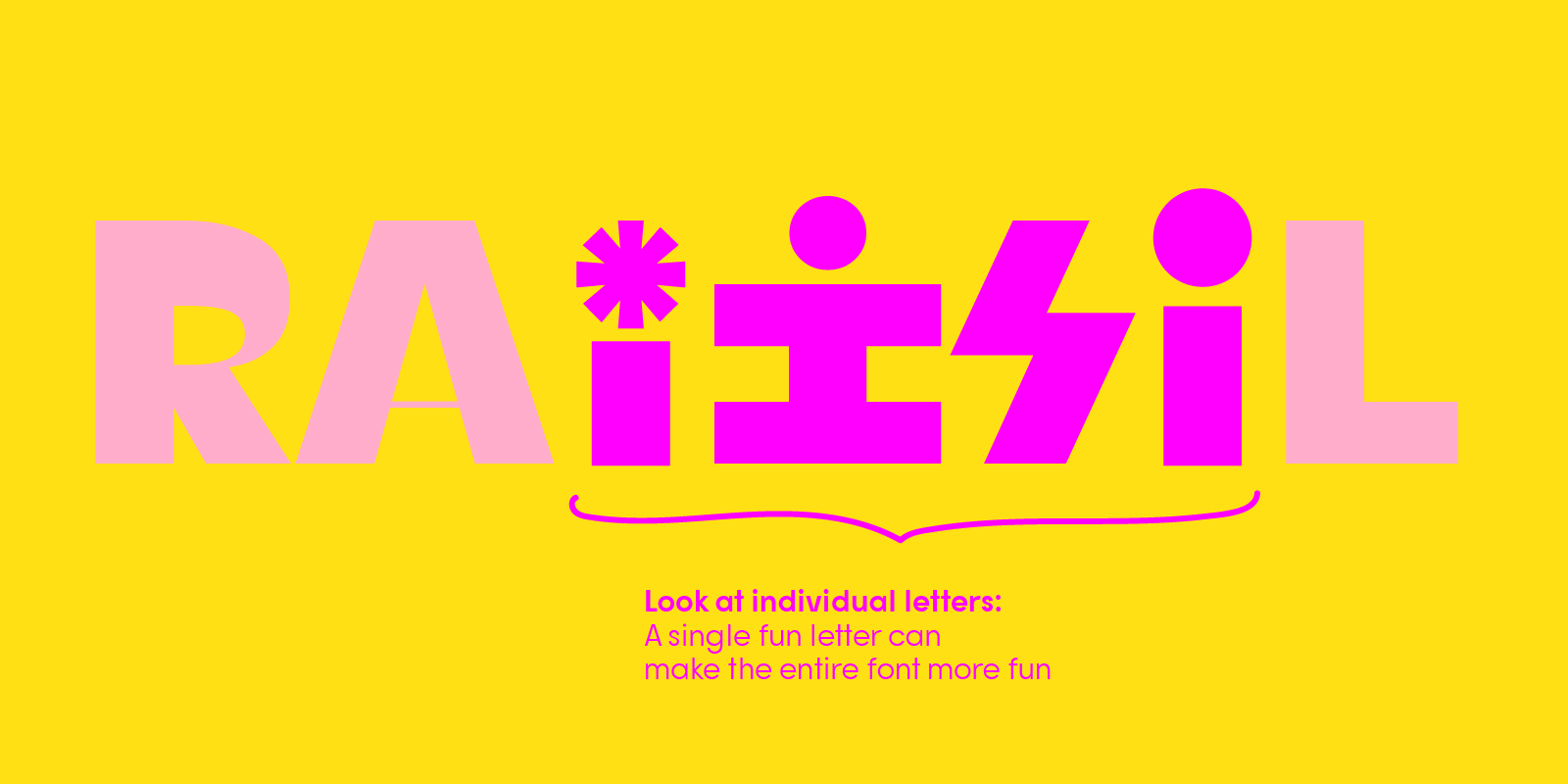
The Rail font is similar to Bool (very top)—its counters are also shifted towards the centers. All crossbars are very thin. Rail comes with the alphabet in Latin characters and stylistic sets, for example, alternative designs for the lowercase letter i.
Stylistic sets are a design feature that makes it easy for designers to add more fun to any design, may that be for logos or funky titles on cards and t-shirts.
10. Goji, rounded font with fun stylistic alternates


The Goji font is a safe choice when it comes to picking a fun font for a project. It is a rounded geometric typeface, making it, first and foremost, a friendly font. However, since Goji also has additional letter designs, e.g., for the uppercase letter O, designers can easily create a fun design for kids’ creations.
The aspect of “fun” can be supported easily by picking the right color palette. Lighter and brighter colors, such as yellow, pink, a light green or bright red, help to communicate “happiness.”
11. Miox, fun bubble font

Miox is a groovy bubble font with rounded counters for a soft-brush quality creating inky strokes that add to its casual look. Bold bubble terminals make this font cozy in its bolder weights, upside-down designs such as the letter s (wider upper body than the usual wider body) create a fun personality.
12. Rati, cool fun font for logos and branding

Rati is a cool font with contrast (thinner and thicker strokes combined in a letter). It looks modern which makes it a great fit for contemporary branding. Rati has alternate glyphs (letters that can be swapped out, e.g. letter R shown in the image above). The axis for counters is slightly tilted to the left, adding a personal style. This font works well in lighter and bolder weights.
How to swap letters with stylistic alternates: Stylistic sets of a font can be accessed in design programs such as Illustrator, Canva, Figma, and Cricut. If you’re downloading and installing these fonts to use in simple text programs such as Word, you can only type in the font’s regular letters.
Fun fonts FAQ
What makes a font look fun?
Fun fonts usually have playful details such as rounded shapes, unexpected angles, quirky proportions, or handwritten strokes. These design choices make the letters feel more casual, energetic, and friendly compared to traditional serif or sans-serif typefaces.
Where should I use fun fonts?
Fun fonts work best in headlines, logos, packaging, posters, and social graphics—places where you want to grab attention and show personality. For longer body copy, pair them with a simpler sans-serif or serif so your text stays readable.
Are fun fonts good for logos and branding?
Yes, fun fonts can be great for brands that want to feel approachable, youthful, or quirky. For professional branding, pick a fun font with well-drawn letterforms (like Bool, Goji, Miox, or Rati) and test it at different sizes to make sure it stays legible.
How do I pair fun fonts with other typefaces?
When pairing fun fonts, use them for display roles (logos, headings, callouts) and combine them with a simple, clean font for body text. Look for contrast in weight or style—such as a bold fun display font with a neutral sans-serif—so each font has a clear job in your layout.