
Eco-friendly font & type design
In the image below, notice the round counters in Vole, round endings (e.g. shoulder in letter r, terminal in letter c) in Bauhaus Soft, the emphasis on “round” on a reverse-contrast typeface such as Pout, round endings in a rounded font such as Goji, and shortened stem height of the letters r and n and d to stress the circle shapes of those letters.
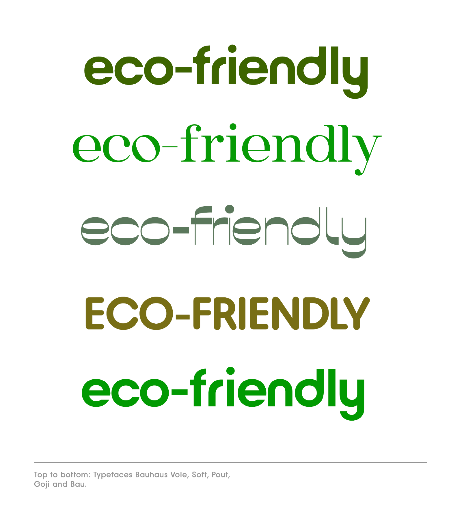
Top to bottom: typefaces Bauhaus Vole, Soft, Pout, Goji in all caps and Bau in lowercase.
Eco-friendly font styles communicate resourcefulness, simplicity and modernity. They fit in, as opposed to standing out, they often use a thinner vs. a very bold font weight, and can use lowercase formatting to show how approachable they are. Eco-friendly or sustainable font styles can have rounder counters, the inner shapes in letters, e.g. the eye cutout inside the lowercase letter e. These fonts are softer and literally rounder. Potential serifs (little feet at the letter endings) can be rounded and ears and finials (the ending of e.g. letter e) can be rounded too.
A popular rounded typeface is Arial Rounded, designed by Robin Nicholas and released by Monotype in 1982. Another, more recent popular rounded font is Brandon Grotesque, designed by Hannes von Döhren in 2010.
The Mojomox logo maker with logotype lets you test text in different fonts and swap out letters for an even more custom feel. Read more about wordmark logos.
Pick from alternative letter design to customize your logotype.
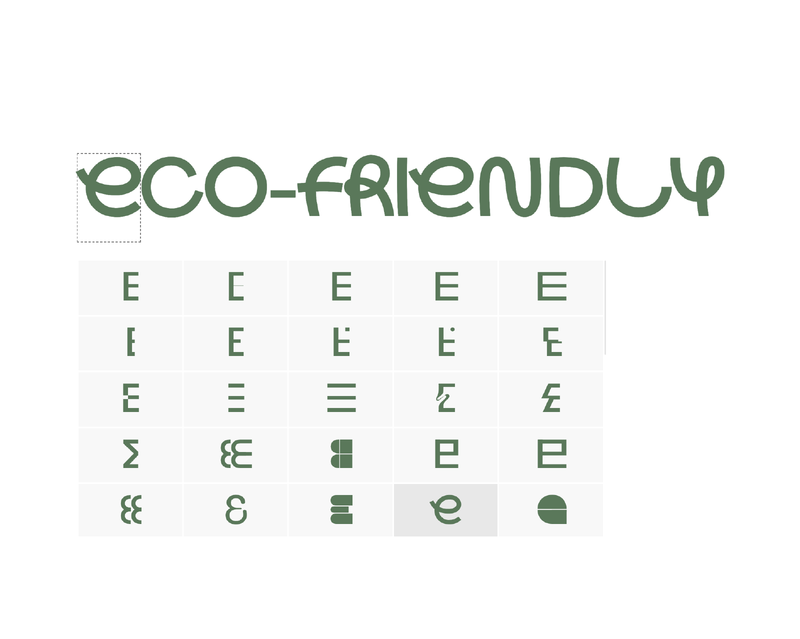
If you want to test different friendly type and how they feel, click through the “Fonts” menu on the right sidebar inside the logo maker app. The font shown in the image above is Bauhaus Lace, a geometric handwritten font. Once you’ve selected your logotype, click on a letter to pull up alternative letter designs. Scroll through the options, click one an it’ll get replaced. The result will be a more custom logotype design.
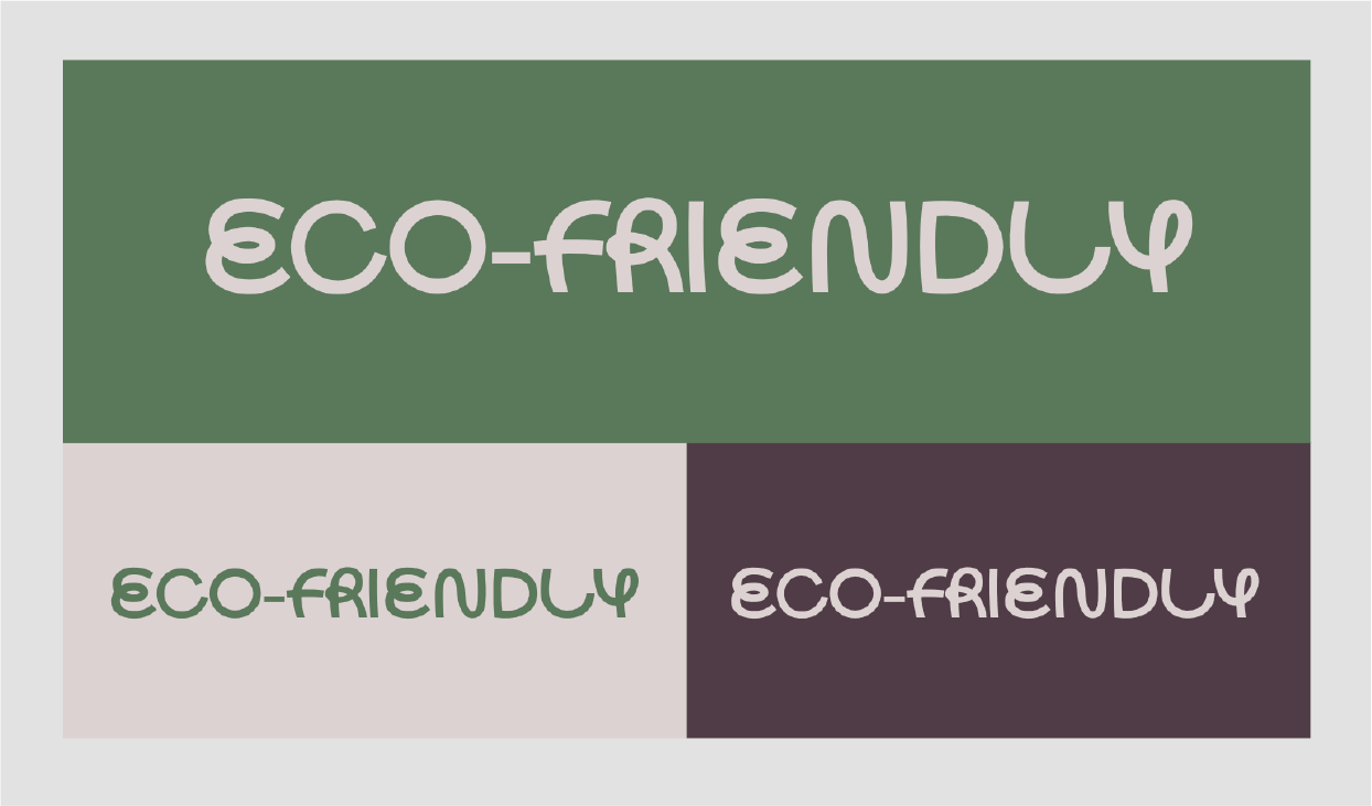
Friendly font Bauhaus Lace as logotype in a muted color palette to communicate sustainability.
This logotype is Bauhaus Lace, a round font that comes in 9 weights, from Thin to Black. Notice how the uppercase spelling gives the logo a more serious look despite the font having an overall round look. The letters are designed in a way to communicate “flow” through a mix between a handwritten style and print lettering.
In branding, besides the logo, the color palette plays a big role in supporting brand traits. Here, we see a muted forest green as a primary color, paired with a light beige paper color and burgundy as an accent color.
Friendly fonts for kids and schools
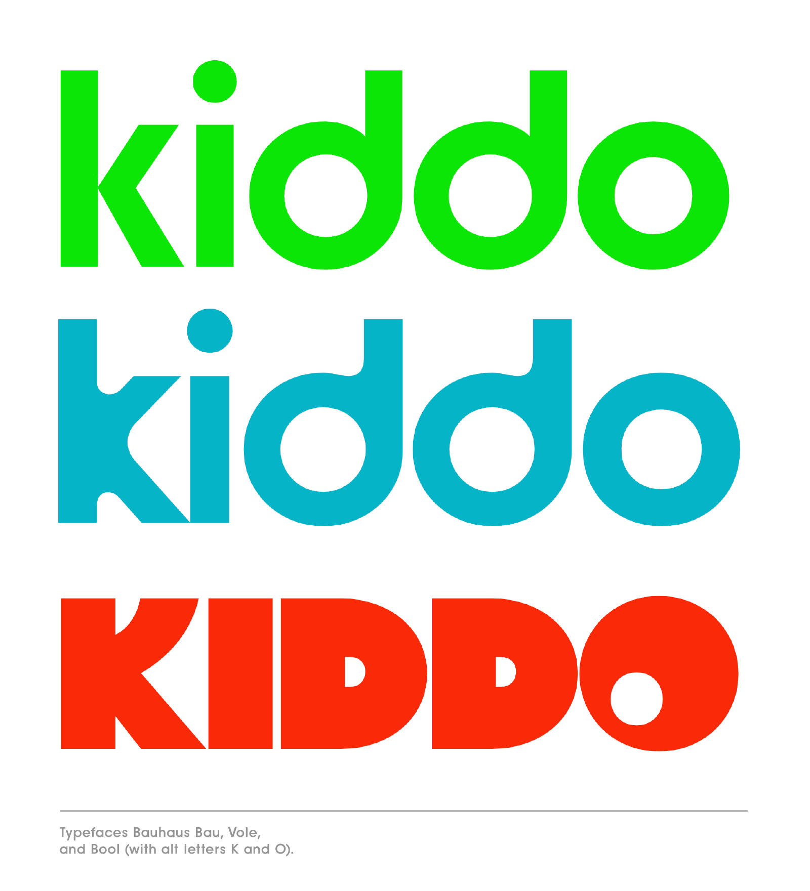
Typefaces Bauhaus Bau (rounded type), Vole, and Bool with alternative letters K and O.
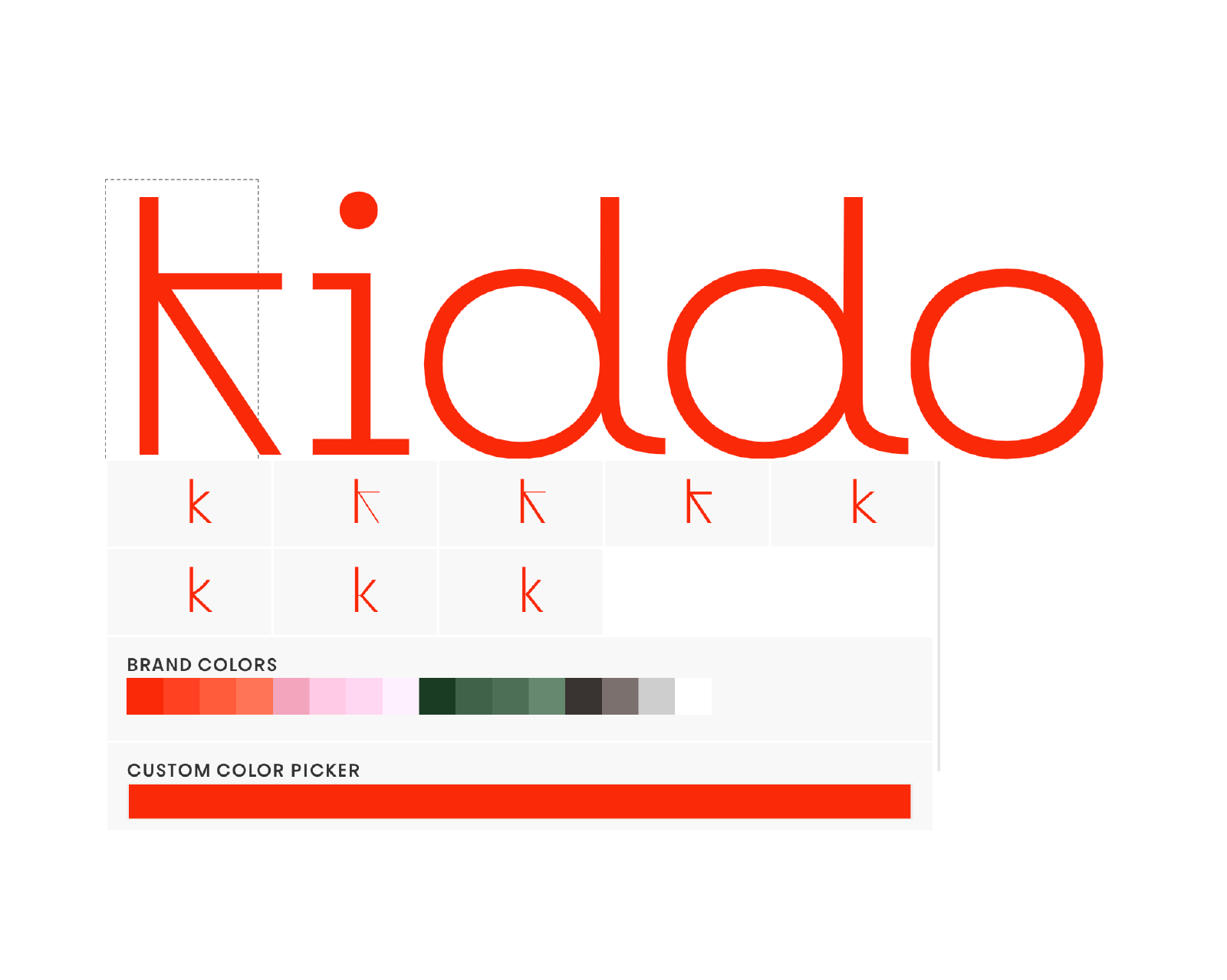
Rounded fonts for logotype can be balanced in different ways by swapping a round letter with a letter of the opposite character, e.g. an edgy letter k.
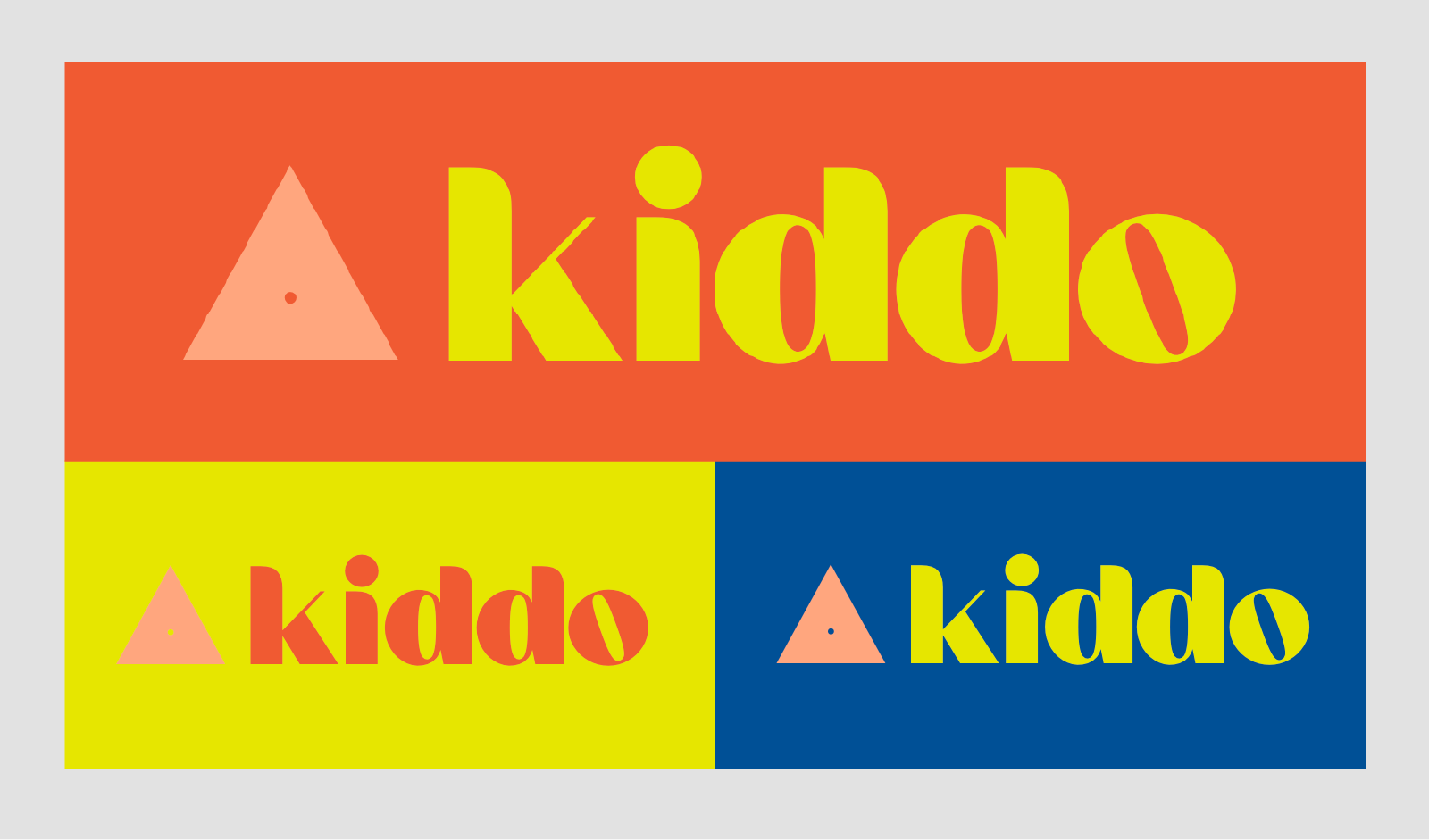
Brand kit featuring a friendly font for a kids logo in a kid-friendly color palette that looks modern and playful. The logo symbol is a triangle with a little hole in the center—it’s simple and minimal in style but it communicates a concept of tiny, or cozy, or much to learn (tip reaching up) in a safe environment (solid base).
Using a friendly font in personal branding
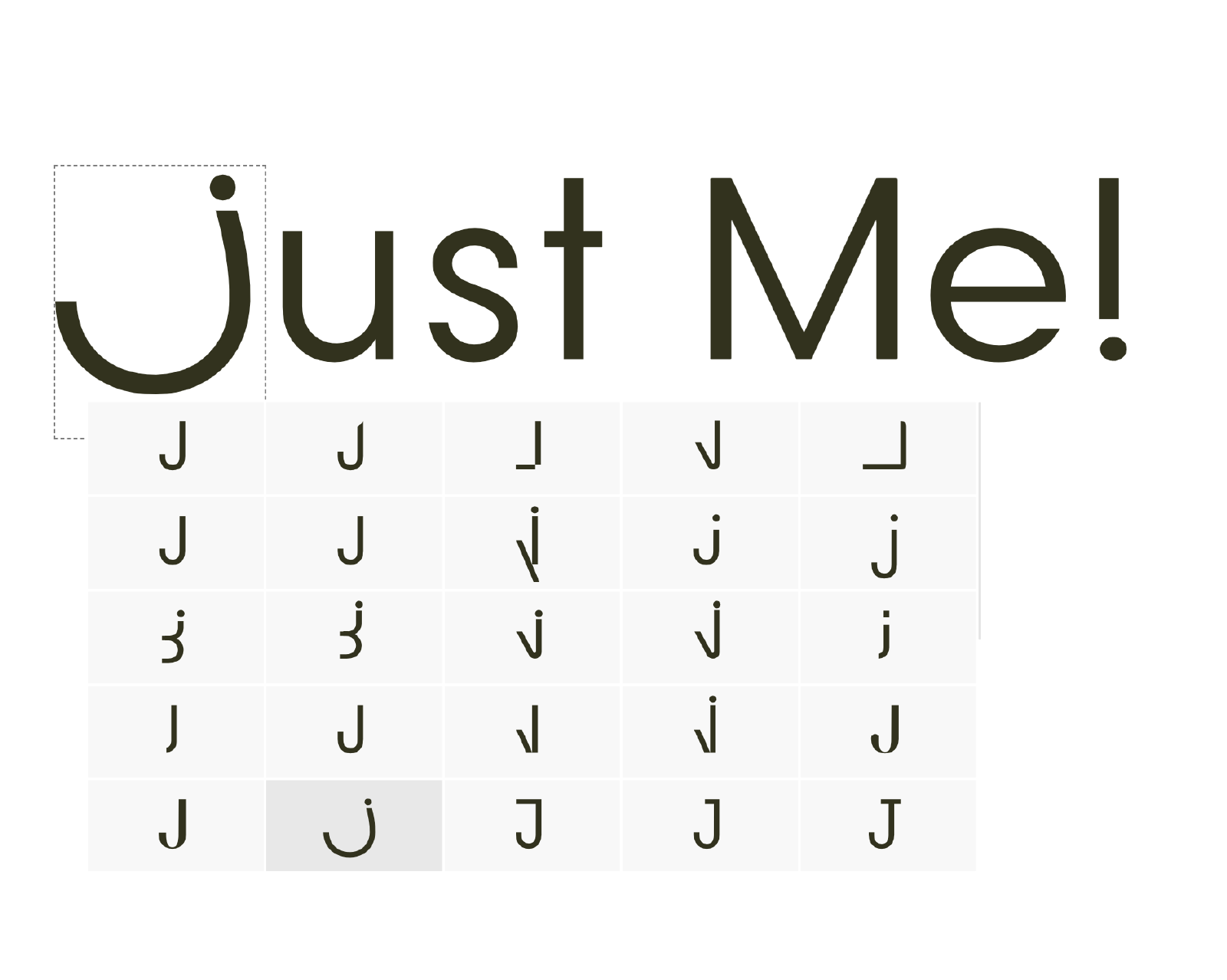
Instead of going for a handwritten style for a personal brand, consider a minimal geometric type and changing specific letters out that are meaningful for your brand. If you pick a custom first letter, you can use it as an avatar for profile images too.
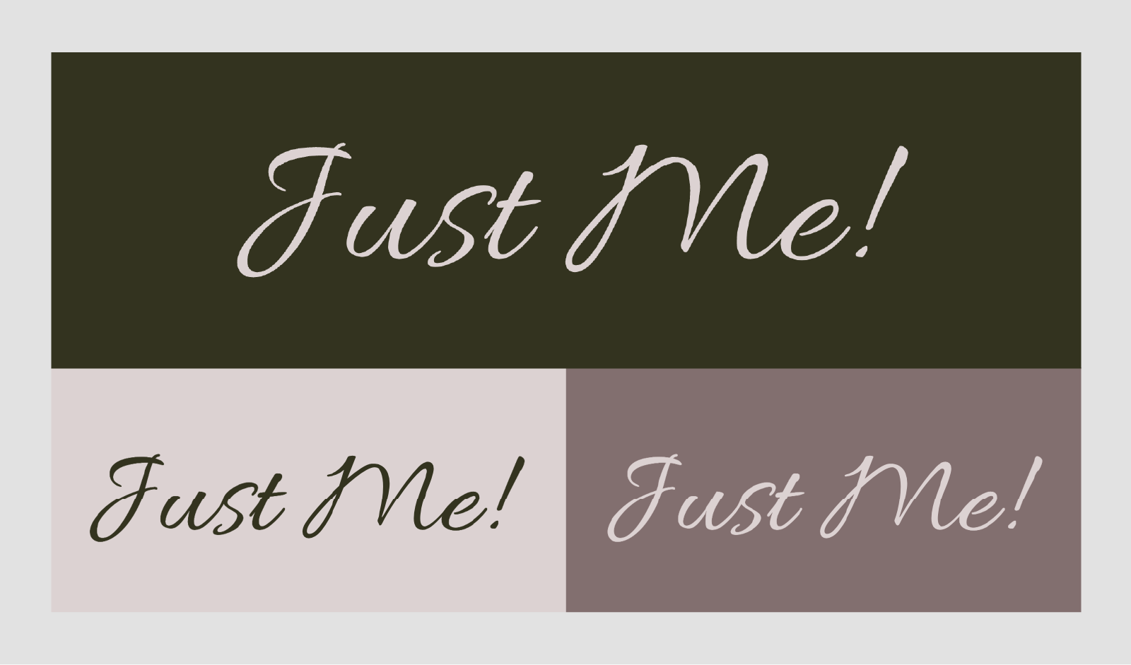
A logo example using a script typeface for a personal brand on a sophisticated color palette (dark green, beige and minimal accent).
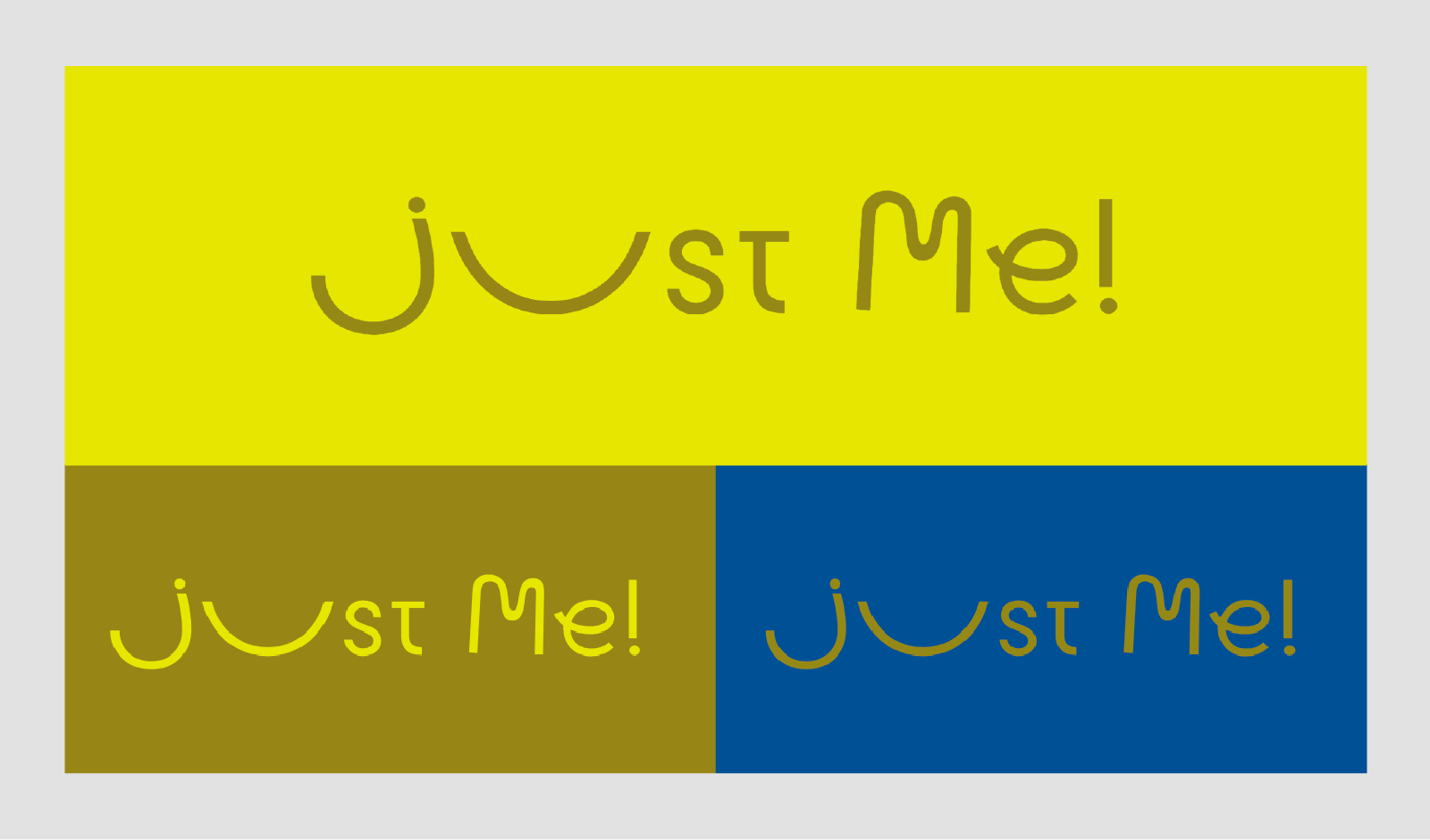
Friendly personal branding that looks professional with a supporting color palette using yellow as the primary color, paired with a flat gold and a medium blue as an accent.